UX/UI B2C "Cart"
UX/UI B2C "Cart"
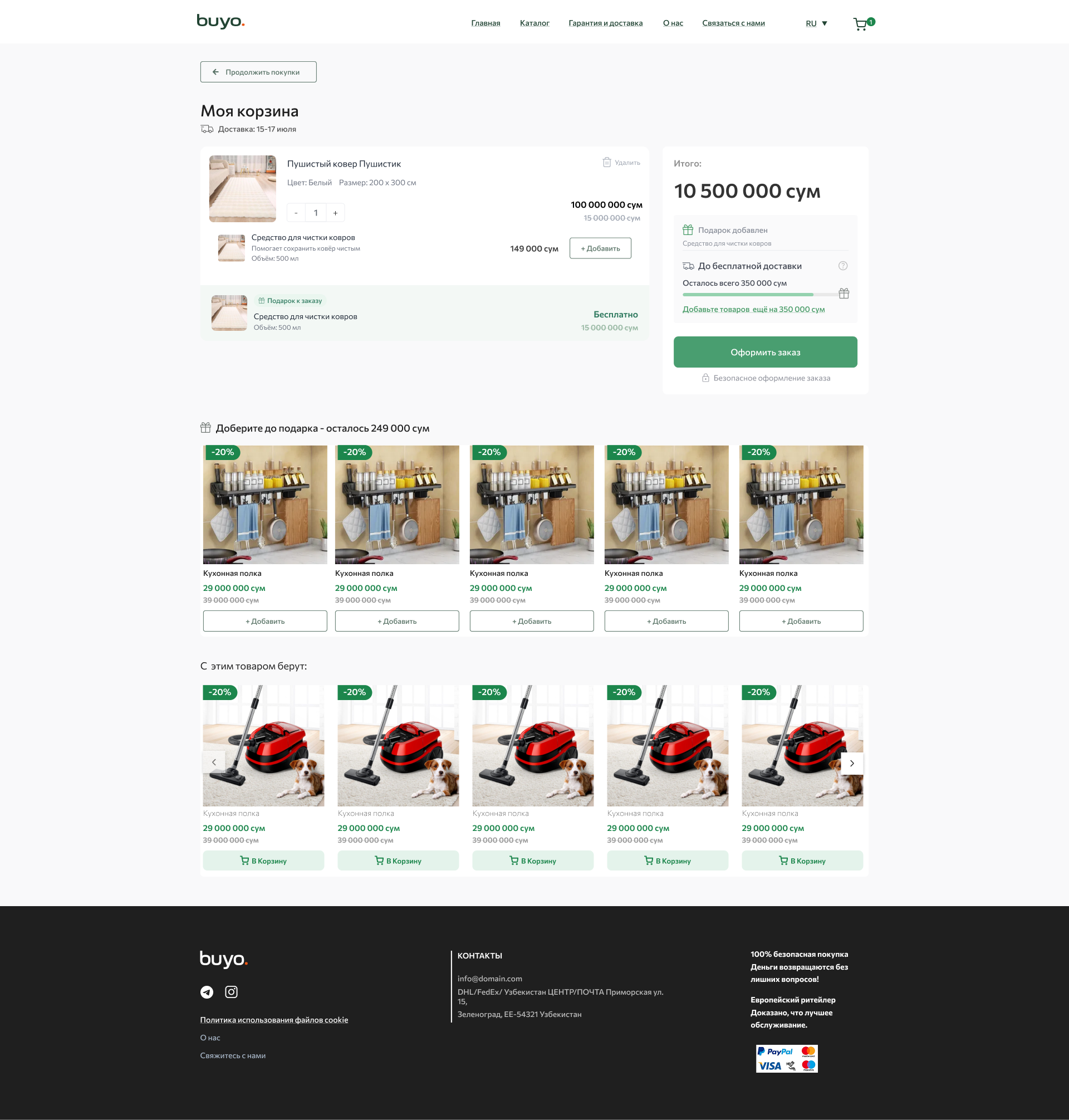
A UX audit of the cart structure and checkout scenario was conducted to identify user loss points.
The information hierarchy was redesigned: the emphasis was shifted to key actions — checkout, progress to free shipping and gift.
The cart user flow was optimized to reduce cognitive load and speed up the purchase decision.
The UX mechanics of upsell/cross-sell blocks (“With this product they take”, recommendations) were thought out to increase the average check without overloading the interface.
Content blocks and CTA buttons were reorganized to improve scanability and user visual focus.
User motivation states were worked out through gamification: progress to gift and free shipping.
The UX of interaction with products in the cart was improved: quantity, removal, addition of related products — with an emphasis on speed and intuitiveness.
A cleaner and more predictable interface composition has been created to increase trust and create a sense of “easy” checkout experience.
E-commerce best practices have been taken into account to increase conversion and reduce the likelihood of abandonment at the checkout stage.
Mobile-first logic for component adaptation and content prioritization for different viewports has been developed.
#Landing #websites #UI/UX-designer #research #business #BusinessAnalyst #b2b
 Kyiv
Kyiv