In 2014 I began work on redesign of the online accountinging service iFin.ua.
Usability research
When I started working with the system, it had already had 300,000 users. 10% of them actively used the website 4 times a year. I decided to rebuild the design of the website completely, but there was a risk that loyalty of existing customers could decrease. New innovative and user-friendly interface would have attracted attention of new users, so customer decided to take a risk.
Ifin old UI
Old interface was built on the standard Bootstrap design.
Rebranding
My main objective was to make new interface simple to use. In addition, I had to add an aesthetic UI to it.
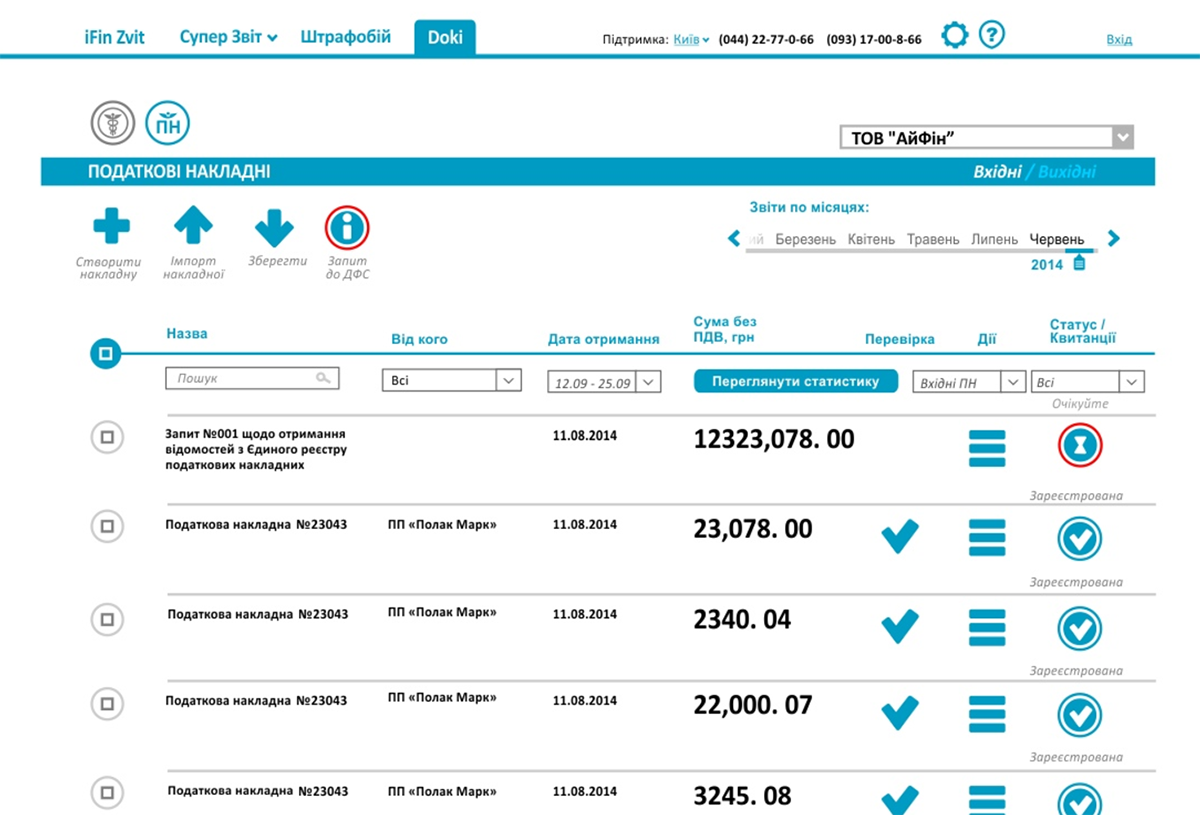
Unique icon set
I've developed a set of icons that greatly improved usability of the interface and reduced user's eye strain. I used only 2 colors (blue - neutral, red - some action is expected).
Modal windows
I maximally simplified the overall look of the interface in order not to confuse new people in accounting sphere. I hide all secondary information in modal windows.
Simplified access to account
I made possible to login using electronic keys. Login process became accelerated (you don’t have to enter email and password) and it literally increased level of service security.
Branded ads style
I’ve developed characters that personified iFin employees for advertising purposes. They were used on online banners and printed booklets.
Development of the new functional
After I have installed the new interface of website we developed a new functionality about document interchange between contractors.
Invoice exchange between contractors
Subscription fee managment
Electronic keys purchase
Usability research
When I started working with the system, it had already had 300,000 users. 10% of them actively used the website 4 times a year. I decided to rebuild the design of the website completely, but there was a risk that loyalty of existing customers could decrease. New innovative and user-friendly interface would have attracted attention of new users, so customer decided to take a risk.
Ifin old UI
Old interface was built on the standard Bootstrap design.
Rebranding
My main objective was to make new interface simple to use. In addition, I had to add an aesthetic UI to it.
Unique icon set
I've developed a set of icons that greatly improved usability of the interface and reduced user's eye strain. I used only 2 colors (blue - neutral, red - some action is expected).
Modal windows
I maximally simplified the overall look of the interface in order not to confuse new people in accounting sphere. I hide all secondary information in modal windows.
Simplified access to account
I made possible to login using electronic keys. Login process became accelerated (you don’t have to enter email and password) and it literally increased level of service security.
Branded ads style
I’ve developed characters that personified iFin employees for advertising purposes. They were used on online banners and printed booklets.
Development of the new functional
After I have installed the new interface of website we developed a new functionality about document interchange between contractors.
Invoice exchange between contractors
Subscription fee managment
Electronic keys purchase