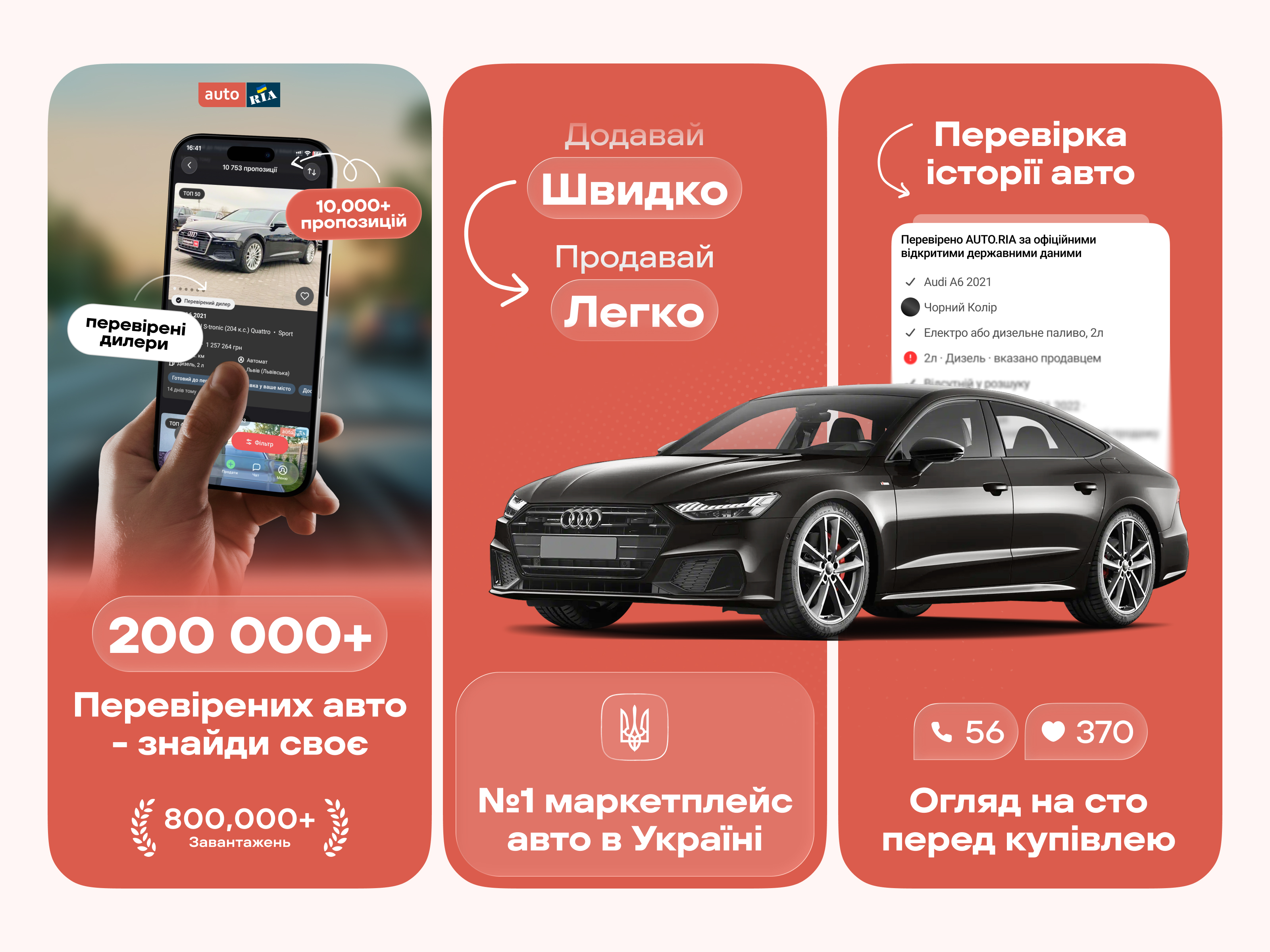
A fresh App Store screenshot concept for AUTO.RIA — rethinking how car marketplace value is communicated in a fast, scroll-driven environment.
This redesign focuses on clarity, hierarchy, and emotional impact. While the original screenshots feel feature-heavy, this concept simplifies the message into bold, easy-to-scan statements paired with strong visual anchors.
Key ideas behind the concept:
Clear value-first communication (200k+ verified cars, #1 marketplace)
Strong visual hierarchy with large typography and focused messaging
Emotional product presentation through clean compositions and contrast
Highlighting trust: verified dealers, history checks, and pre-purchase inspections
More premium, modern look compared to the current App Store visuals
The goal was to make the first impression instant — less reading, more understanding
Made in: Figma
Format: App Store Screenshots (iOS)
—
Exploring how simplicity and bold communication can outperform feature overload in marketplace products.