UKR
Задача:
Розробити дизайн трифолд-брошури в брендовій палітрі, для виробника крафтових тростей, яка буде інструкцією по укороченню та використанню трості. Врахувати поважний вік споживачів, зробити дизайн доступним та зрозумілим.
Рішення:
Створено дизайн трифолд брошури, з ілюстрацією та інструкцією по використанню. В проєкті використано більший кегль шрифта для кращої читабельності для погано зрячих людей. Створено фірмовий паттерн для лицевої та задньої частини брошури для підкреслення ідентичності бренду.
EN
Task:
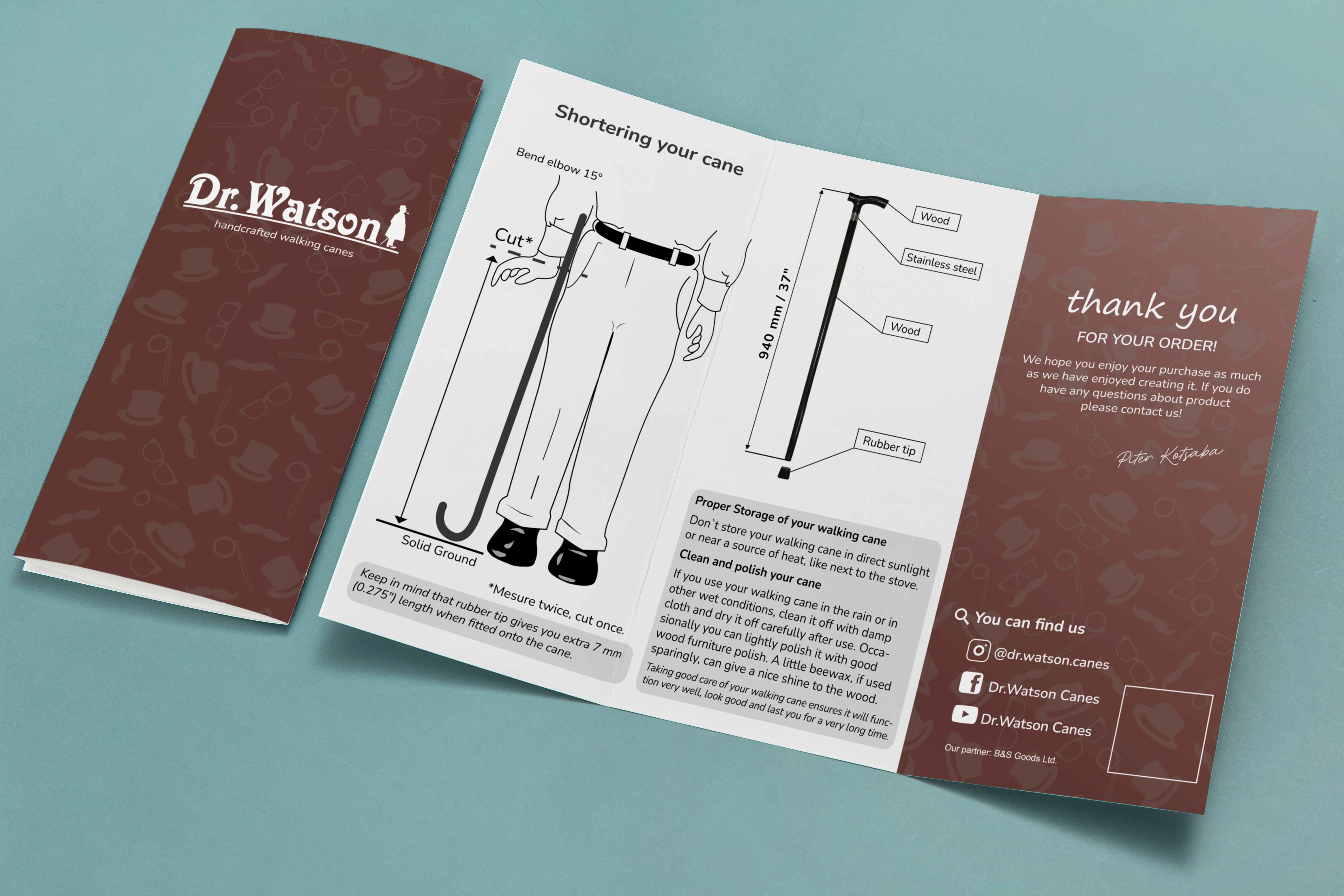
To develop a design of a trifold brochure in the brand palette for a manufacturer of craft canes, which will be an instruction on how to shorten and use the cane. Take into account the advanced age of consumers, make the design accessible and understandable.
Solution:
We created a design of a trifold brochure with an illustration and instructions for use. The project used a larger font size for better readability for visually impaired people. A corporate pattern was created for the front and back of the brochure to emphasize the brand identity.
Інструменти використані в роботі:
Camera Canon EOS 600D
Adobe Illustrator
Google Fonts
Задача:
Розробити дизайн трифолд-брошури в брендовій палітрі, для виробника крафтових тростей, яка буде інструкцією по укороченню та використанню трості. Врахувати поважний вік споживачів, зробити дизайн доступним та зрозумілим.
Рішення:
Створено дизайн трифолд брошури, з ілюстрацією та інструкцією по використанню. В проєкті використано більший кегль шрифта для кращої читабельності для погано зрячих людей. Створено фірмовий паттерн для лицевої та задньої частини брошури для підкреслення ідентичності бренду.
EN
Task:
To develop a design of a trifold brochure in the brand palette for a manufacturer of craft canes, which will be an instruction on how to shorten and use the cane. Take into account the advanced age of consumers, make the design accessible and understandable.
Solution:
We created a design of a trifold brochure with an illustration and instructions for use. The project used a larger font size for better readability for visually impaired people. A corporate pattern was created for the front and back of the brochure to emphasize the brand identity.
Інструменти використані в роботі:
Camera Canon EOS 600D
Adobe Illustrator
Google Fonts