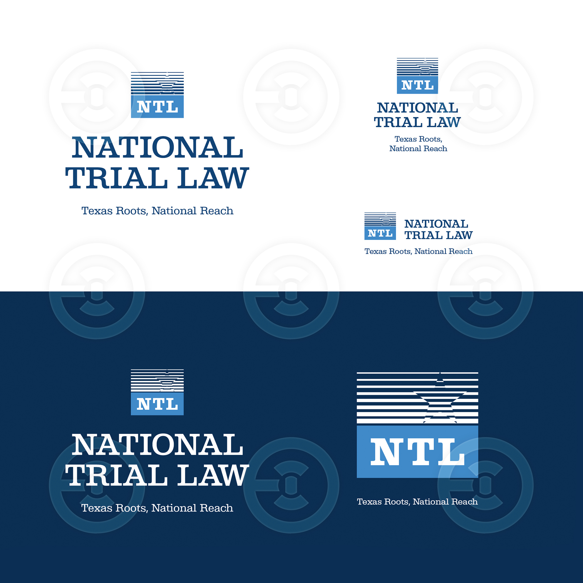
The blue color of the logo mark symbolizes hope. The gradient serves as a reminder that darkness is never permanent — it gives way to light. A subtle star silhouette references the firm’s Texas roots, expressing weight and confidence, strength of character, responsibility, and solidity.
These qualities are reinforced by the wordmark. Its elegant serif typeface features more substantial serifs than those found in common corporate standards such as Times, making the mark not ornamental, but balanced, functional, and highly legible across scales — particularly in inverse applications.
Together, the symbol and the wordmark connect the logo to the firm’s origin, character, and values: straightforwardness, honest agreements, and a tangible sense of confidence and authority.
“We did not grow in an abstract corporate environment, but in a real, demanding, and competitive market. If something is built, it works — it does not merely look good. Our empathy is not performative; it is measured in real capability inside the courtroom.”
These qualities are reinforced by the wordmark. Its elegant serif typeface features more substantial serifs than those found in common corporate standards such as Times, making the mark not ornamental, but balanced, functional, and highly legible across scales — particularly in inverse applications.
Together, the symbol and the wordmark connect the logo to the firm’s origin, character, and values: straightforwardness, honest agreements, and a tangible sense of confidence and authority.
“We did not grow in an abstract corporate environment, but in a real, demanding, and competitive market. If something is built, it works — it does not merely look good. Our empathy is not performative; it is measured in real capability inside the courtroom.”