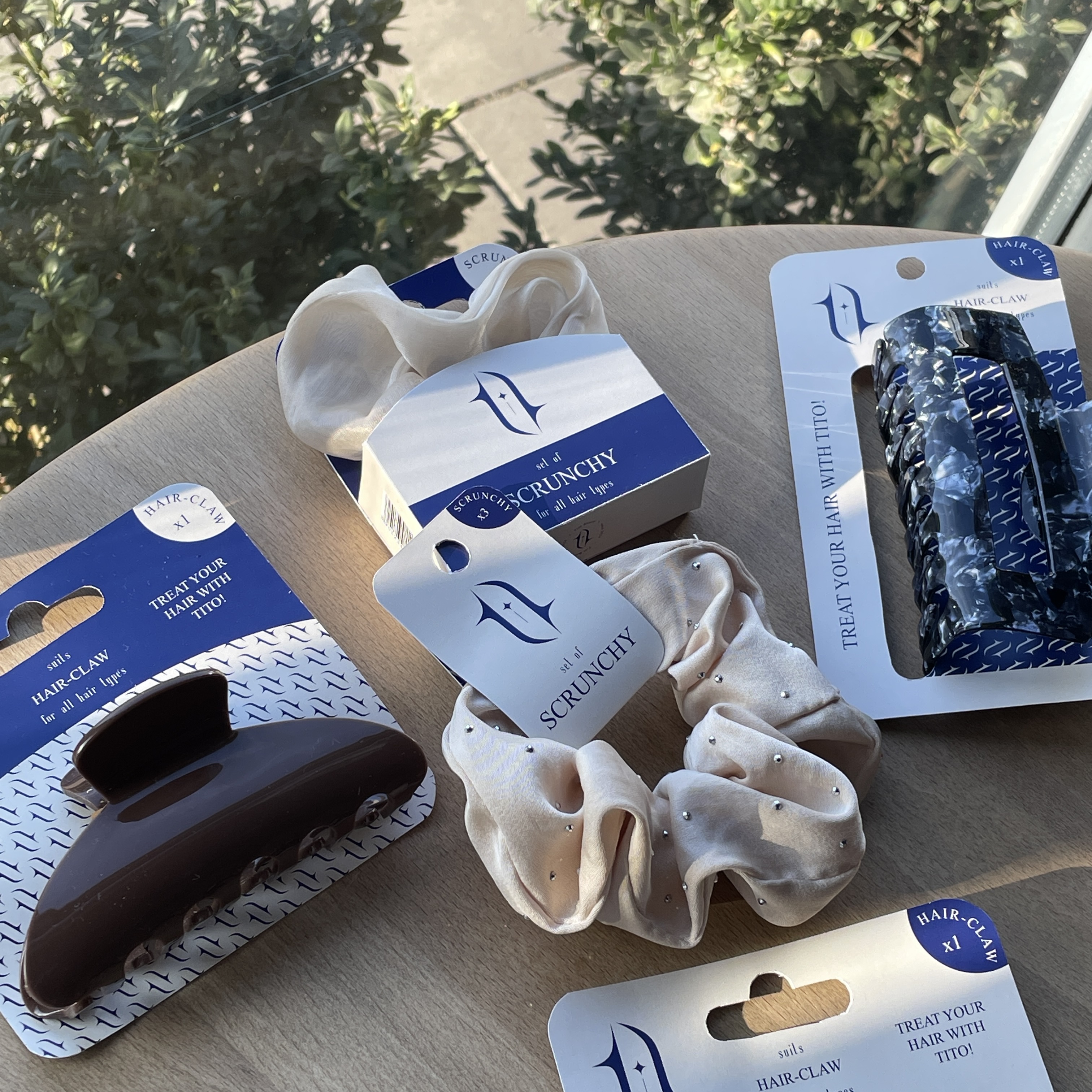
The Tito Beauty packaging was developed as part of the brand’s visual identity for a hair accessories line. The design combines clean geometry, balanced composition, and a premium aesthetic, creating a cohesive image of a modern beauty brand.
At the core of the visual system is the brand’s monogram — a fluid graphic symbol that echoes the natural movement and softness of hair. It serves as the main accent across all packaging elements: backing cards for hair claws, boxes, and tags for scrunchies.
The signature palette — a deep, saturated blue paired with a warm beige — creates a refined yet contrasting visual mood. The custom pattern, built from a modular repetition of the monogram, adds rhythm and character without overpowering the product itself.
All information blocks are structured clearly and thoughtfully: product type, size, and tagline are easy to read and do not clutter the layout. This logical hierarchy makes the packaging feel like a complete, scalable system adaptable to various SKU types.
The final result is a harmonious balance between form and function: the packaging enhances the brand’s hair-care aesthetic, conveys a sense of quality, and makes the products visually appealing both in retail settings and online.
#package #упакування #естетика