Adaptive website layout.
HTML & CSS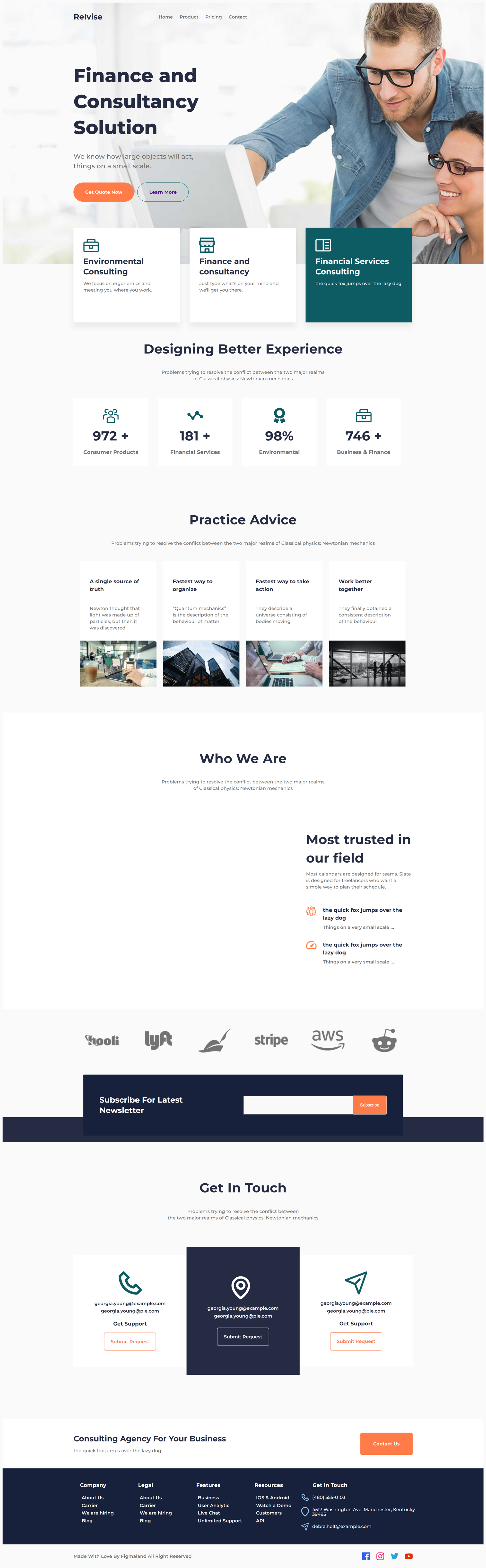
Adaptive website layout with Flexbox, BEM methodology for organizing code and styles.
Responsive website for mobile devices, tablets, PCs, televisions.
Flexbox: for creating flexible and responsive layouts.
Sass: using variables, mixins, and nesting for more structured code.
BEM: methodology for organizing CSS code.
Responsive website for mobile devices, tablets, PCs, televisions.
Flexbox: for creating flexible and responsive layouts.
Sass: using variables, mixins, and nesting for more structured code.
BEM: methodology for organizing CSS code.