almalab
Logo Design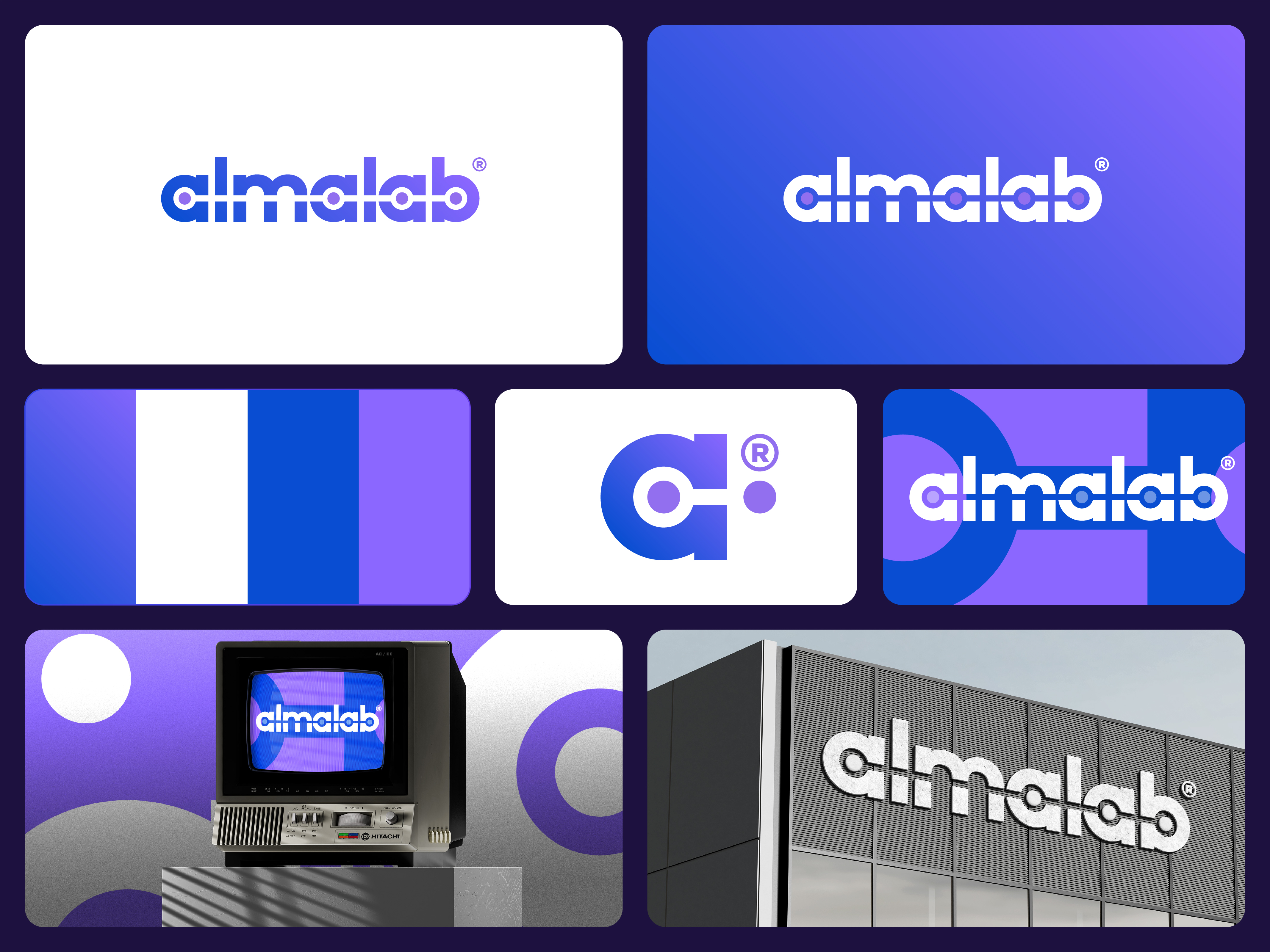
Development of a logo for a web studio in Kazakhstan that specializes in website creation, logos, and SEO promotion.
Font option. The logo is a stylized image of the word almalab, in which the letters are connected by a horizontal line passing through the center and forming three circles-dots, integrated into three letter a's and the letter b. These elements look like nodes of a line, creating an effect of a system or chain.
The meaning and metaphors embedded in the symbol:
LAB – a systematic approach, structure, experiments
The line with dots forms a visual “base,” resembling an axis or diagram — a reminder of scientificity, structurality, and a systematic approach to projects.
The dots resemble nodes or signals on an oscilloscope, referring to research, laboratory precision, but in a digital key.
Digital/technological subtext
The logo resembles schematics in interfaces, data routes, lines of code, as well as interaction maps (user journey). A straight line can be perceived as: an information conductor (digital signal), a project highway (from idea to implementation), or even a route from start to result (user path, brand strategy).
Creativity and branding
Using geometric modifications of letters indicates an unconventional approach, reflecting the creative potential of the team. The symbol is visually simple but conceptually rich — an ideal balance of creativity and logic, important for an agency that combines branding and analytics.
What the elements symbolize:
Horizontal line: Connection, logic, path, structural approach
Circles/dots: Nodes, focal points, stages, decision points
Merging of letters and line: Integration, integrity, seamless processes
Geometry and rhythm: Systematicity, modularity, technologicality
Color
Transition from blue to purple — emphasis on combining scientific rigor and creative freedom.
Blue = trust, technology, analysis.
Purple = imagination, brand thinking, depth of ideas.
The gradient emphasizes movement, development, digital character of the company.