and flower. Day of Saint Valentine
Print Design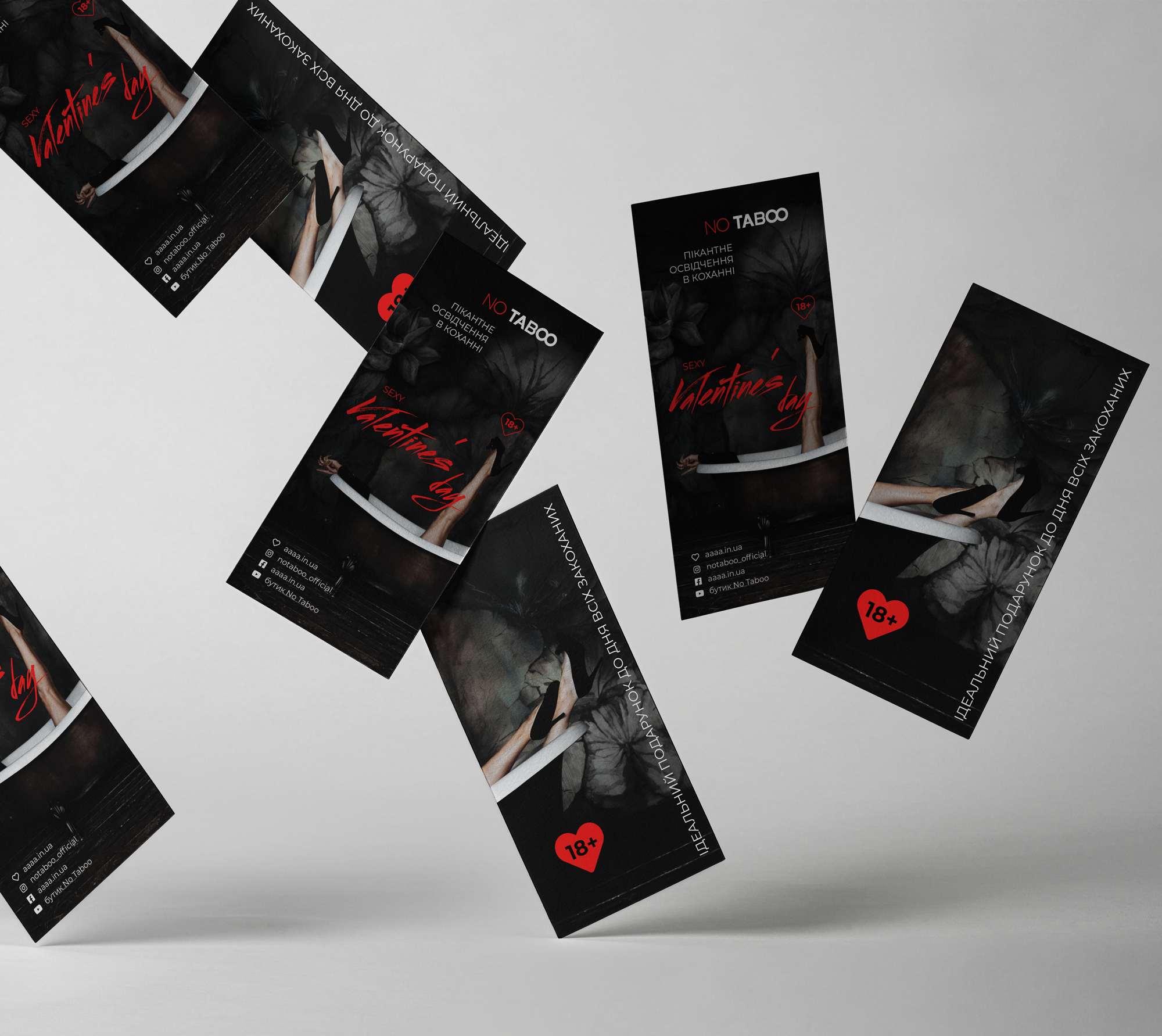
The specificity of the brand implies sexual design. I decided to emphasize sexuality with sensitive photographs, the headline font (the tush imitation gives the feeling that the inscription is made in a swallow, in a break of passion, as a cosmetic), and also a clear signs of 18+. At the same time, the picture was not vulgar, but it was immediately clear about what it was about. She indicated the contact details, but did not emphasize the attention on the brand, as the store network has long occupied a place on the market. The purpose of the newsletter is to congratulate the holiday and help make the right choice of the gift, rather than present a new shopping point, for example.
#DesignPolyography #Flower #Listings
#DesignPolyography #Flower #Listings