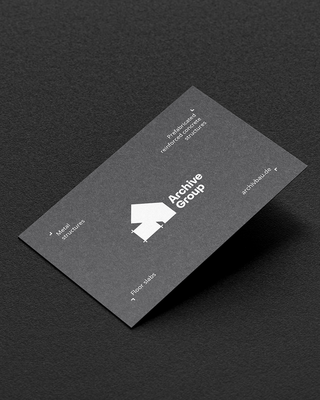
Development of visual identity that emphasizes the reliability, strength, and modernity of the company, demonstrates a technological approach and engineering precision, allowing ArchiveGroup to appear professional and confident in both the B2B market and public tenders. The identity should include: A static, concise, geometric logo that references constructions, metal, or tiles. The logo works in both color and monochrome (especially on drawings, plans, documentation). A technical, restrained font with good readability. The use of letters/forms that resemble drawings, templates, or concrete blocks.
Color palette -
Gray (concrete), graphite (metal), white (functionality), + acceptable accents in this case - orange.
Graphic elements/patterns - hints at textures: concrete, tile joints, steel beams, perforated sheets. Stylized use of technical symbols (for example, conventional markings from drawings) is possible.
Developed - business cards, branded technical documentation, layout of the tender application page, worker's jacket with logo, external banner at the construction site, cover of the company magazine.
Brand tone of voice -
Dry, technical, business style. Minimum emotion — maximum precision.
Key phrases: “Engineering simplicity”, “We form the foundation”, “Strong. Precise. On time.”
Color palette -
Gray (concrete), graphite (metal), white (functionality), + acceptable accents in this case - orange.
Graphic elements/patterns - hints at textures: concrete, tile joints, steel beams, perforated sheets. Stylized use of technical symbols (for example, conventional markings from drawings) is possible.
Developed - business cards, branded technical documentation, layout of the tender application page, worker's jacket with logo, external banner at the construction site, cover of the company magazine.
Brand tone of voice -
Dry, technical, business style. Minimum emotion — maximum precision.
Key phrases: “Engineering simplicity”, “We form the foundation”, “Strong. Precise. On time.”