Banner
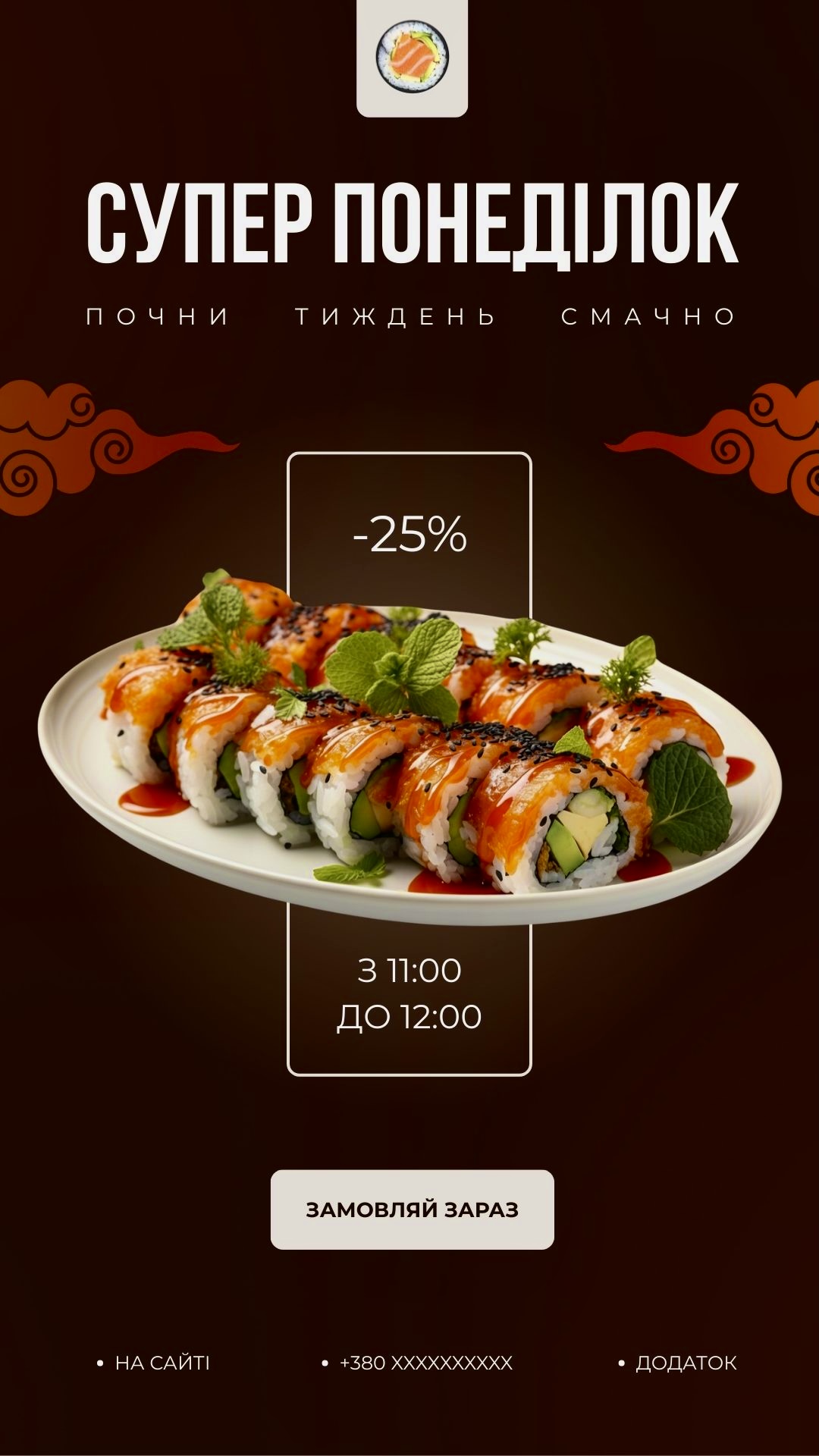
The dark brown color palette creates a warm and elegant atmosphere, while the soft gradient behind the sushi adds depth and draws attention to the product. Light and contrast help highlight key elements of the composition. The main headline uses expressive typography that forms a strong visual emphasis. The auxiliary text is stretched horizontally, adding dynamism. The central block with rounded borders emphasizes the size of the discount and the duration of the promotion, ensuring a clear visual hierarchy. The final banner combines an understandable structure, balance, and bright accents, effectively conveying the advertising message and stimulating interaction with the audience. The work demonstrates attention to detail, composition, and brand identity.
 Dnepr
Dnepr