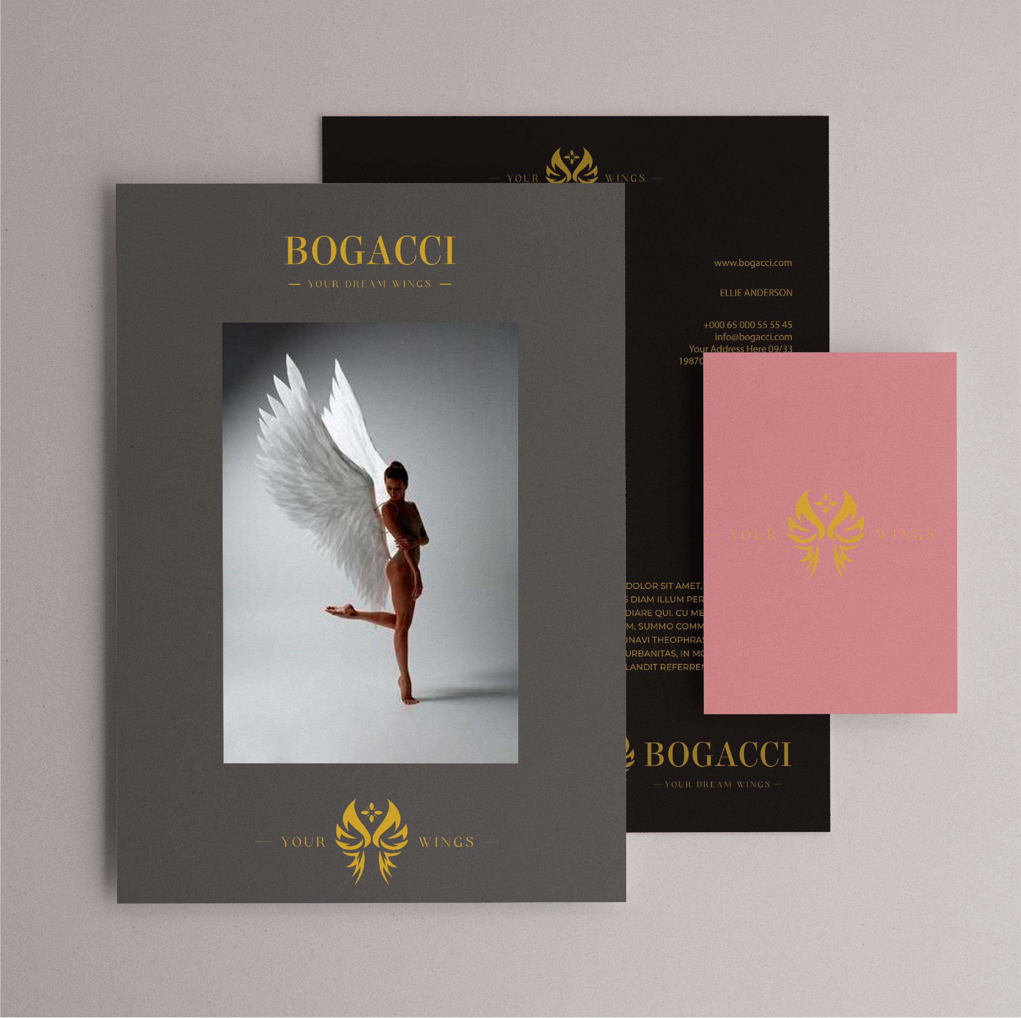
In the development of the logo, an illustrative sign was created that resembles the wings and directly indicates the main product of the brand.The name of the brand is the Elsie Regular, a classic Romanic font with thin seats that best illustrates the brand’s elegance and premium.For the descriptor, a fine font with seats is used - The Cartel.This font can be used not only for the descriptor, but also in the brand’s advertising creatives and as a headline in brochures and certificates.The brand’s identity is made in three main colors: black, gold, deeped pink.At the same time, I recommend for the dark range of the product to use a combination of gold on black, for light - gold on pink or white background.In the first case, gold on black will add depth and dramatism to the packaging or polyographic products.In the case of a light range of the product, gold in combination with a dried pink or white will provide a sense of ease, air and elegance.For harmonious placement on all the necessary wearers, several versions (compositions) of the logo were created.