Brands That Matter is a unifying project for a series of brands. We create conscious brands that improve the world and the lives of others.
Solution
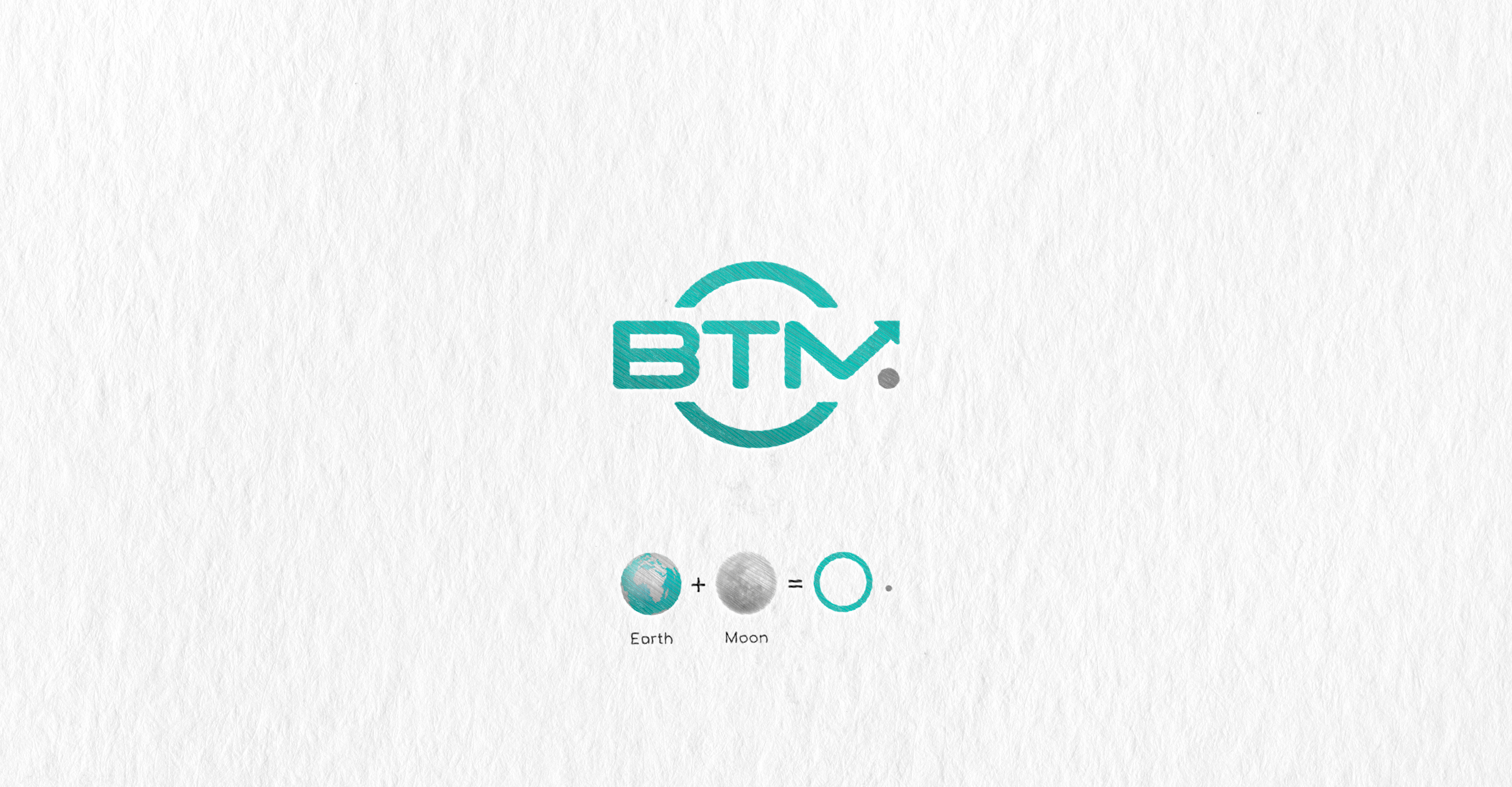
I tried to depict everything the customer wanted to see on the logo. In the foreground, the acronym BTM is like a shield symbolizing protection. The large circle represents the Earth. The small gray circle is the moon, which complements the composition and makes the letter M easier to read. The arrow pointing upward into a distant space symbolizes growth and limitless development.
Solution
I tried to depict everything the customer wanted to see on the logo. In the foreground, the acronym BTM is like a shield symbolizing protection. The large circle represents the Earth. The small gray circle is the moon, which complements the composition and makes the letter M easier to read. The arrow pointing upward into a distant space symbolizes growth and limitless development.