Brand book for fastener dealer EUROBOLT
Corporate Style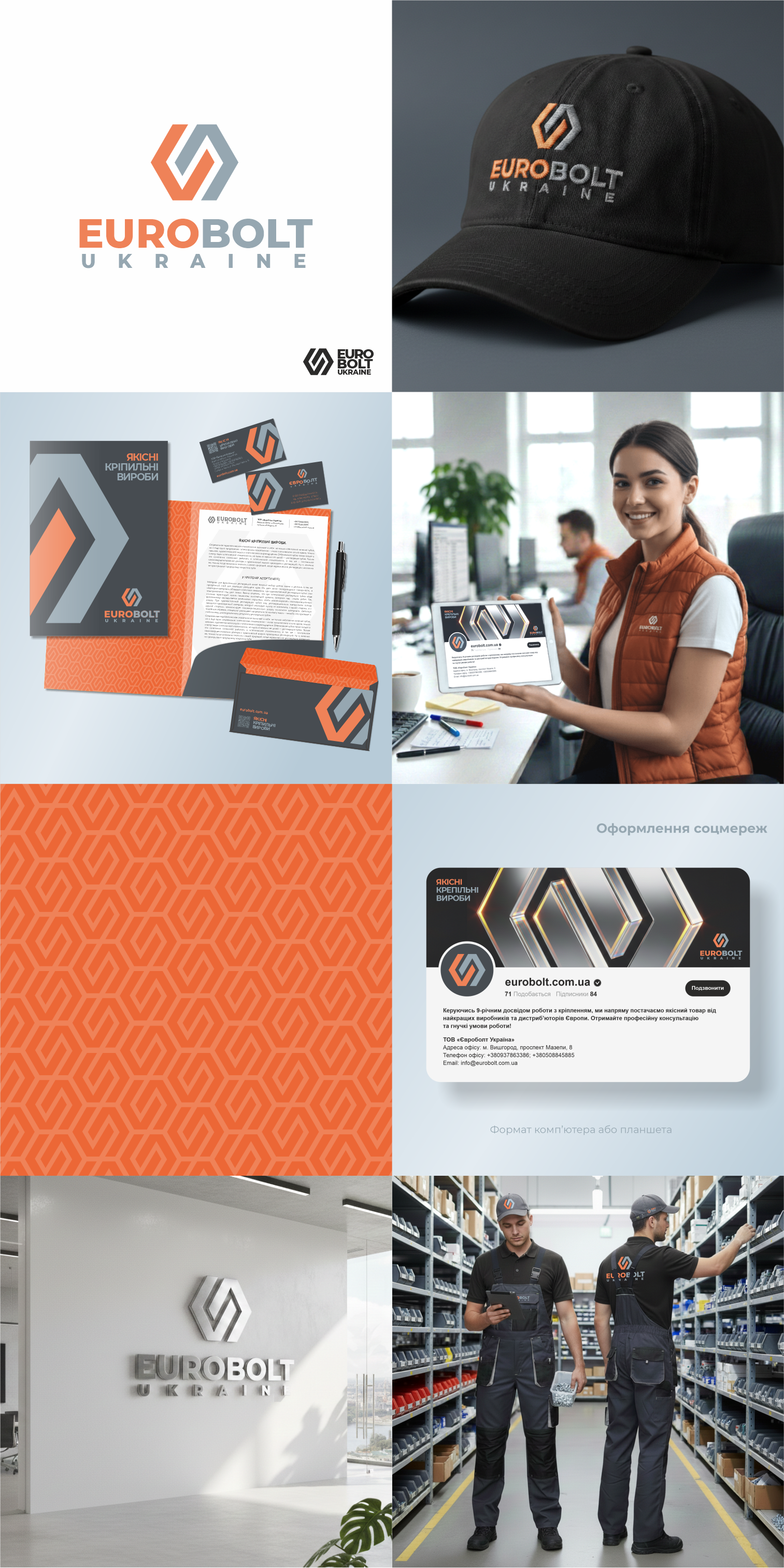
The updated company logo has a consistent, business-like style and conveys a sense of reliability. The symbol in the logo not only conveys the meaning of a strong connection, but also has a uniform hexagonal shape, evoking associations with hardware and construction in general.
The orange hue used in the logo is not only attractive and positive, but also distinguishes the company in the market. Various options are available for the layout of the corporate symbol and the font portion of the logo.
Overall, the logo is concise, convenient for use online and for creating 3D signs.
#logomaker #logotype #logobook #Branding #brandbook #identity #Guideline #Guidebook