Brandbook for a food packaging manufacturer.
Corporate Style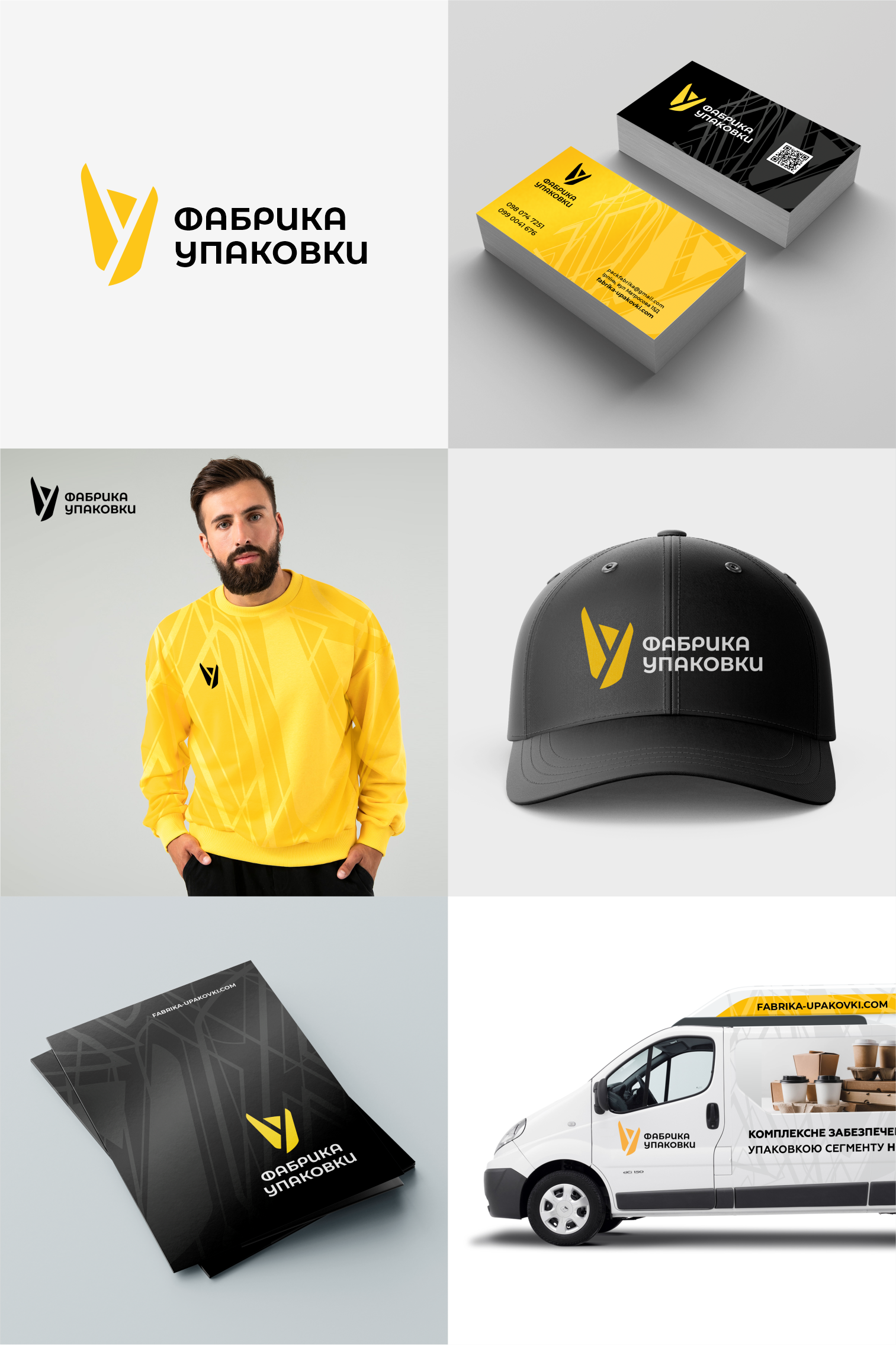
Stylish logo rebranding and corporate identity development for a food packaging manufacturer. An idea that is visually light and carries original meanings: A folded sheet of cardboard forms the first letter of the name - U. At the same time, the symbol resembles a figurine of a happy person who has achieved success and joyfully raised his hands up. You may see other positive and appropriate meanings in this unique sign. The logo scales well and is readable in online and offline media. The work has been approved by the client and is already actively used on the website and other branded media. See here: https://fabrika-upakovki.com/ua/
Or here: https://www.instagram.com/fabrikaupakovki/
Or here: https://www.instagram.com/fabrikaupakovki/