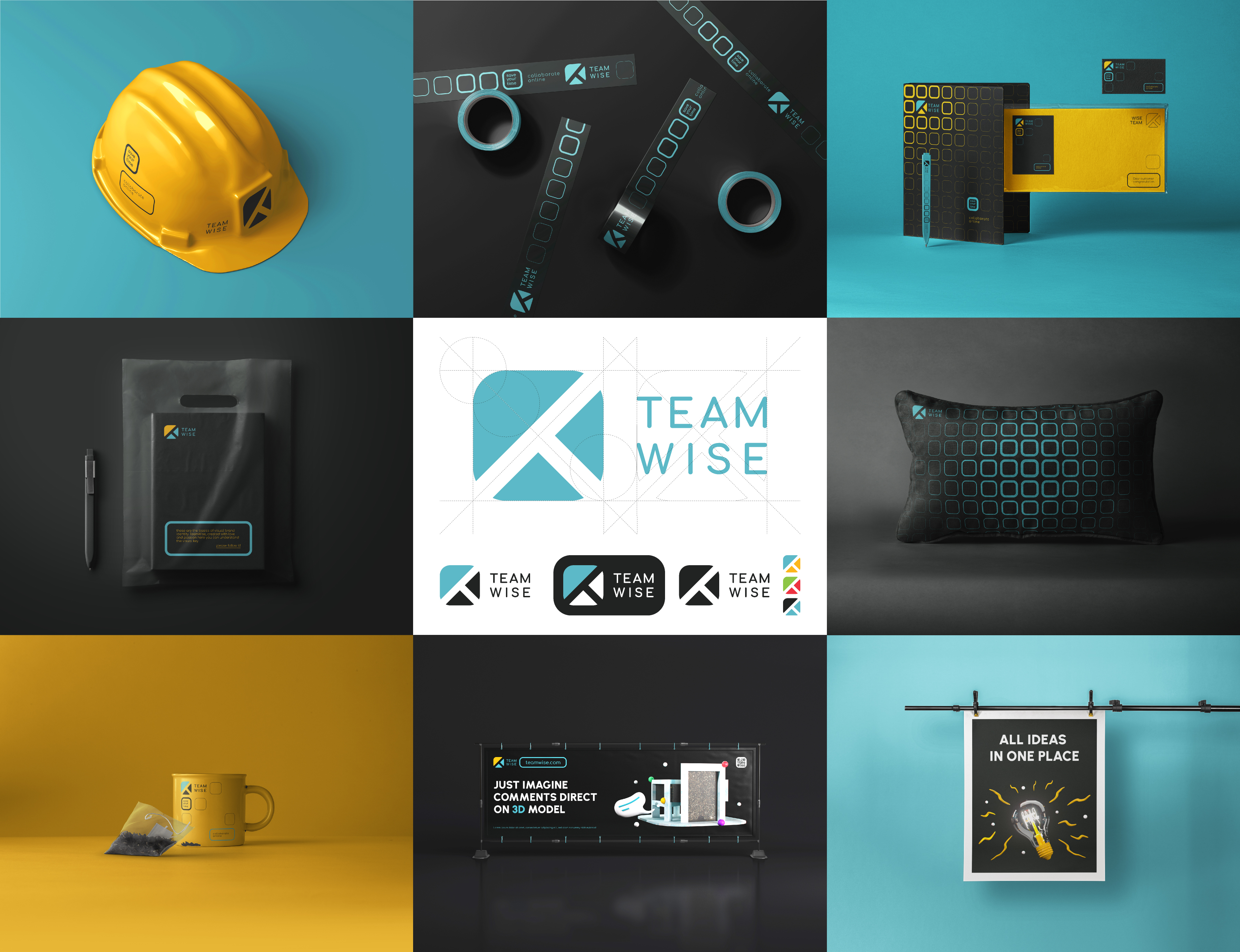
TeamWise is a platform that connects people who are enthusiastic about the equipment, #design and architecture of their homes. That’s why when creating the #logogotype in the big letters #brand in were combined using geometric figures that are made up in the house.
TeamWise is a product with which only positive emotions should be associated, so in design you should use only smooth (circular) shapes.
As in the clock even a small sixth depends on the work of the whole mechanism, so in the teamwork every member of the community is very important, so the contrast of shapes and colors is welcome.