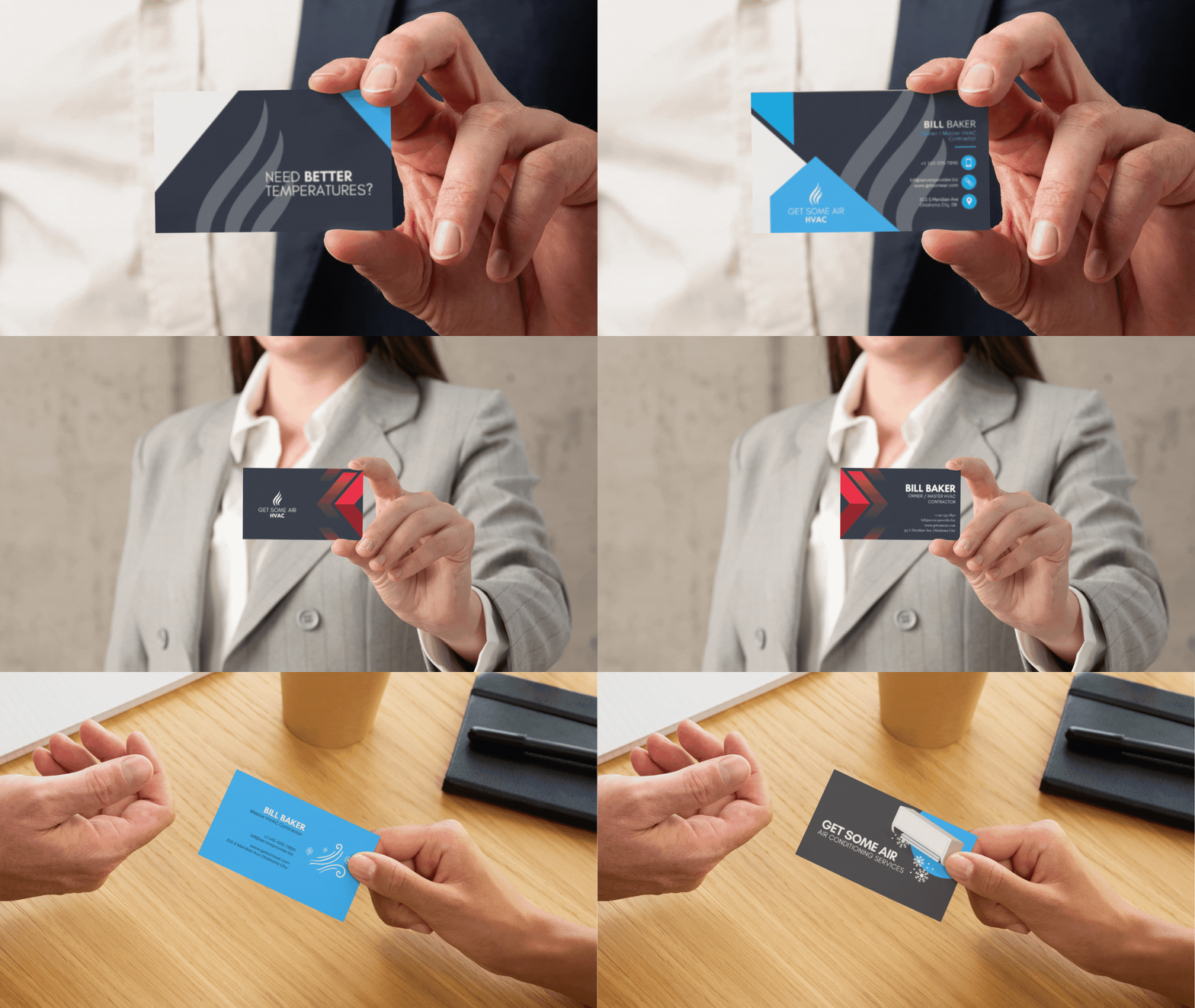
This portfolio entry showcases a cohesive set of modern, professional business card designs created for Get Some Air HVAC, a heating, ventilation, and air conditioning services brand. The designs focus on bold shapes, clean typography, and visual motifs related to temperature control, airflow, and comfort.
Design Goals:
Reflect a trustworthy, modern HVAC brand identity
Use clean, geometric design language to communicate efficiency and reliability
Incorporate visual cues like airflow, temperature gradients, and snowflake icons
Maintain a professional, business-ready layout while adding creative flair
Ensure easy readability and quick recognition of contact information
Key Features:
Front & Back Coordination:
Each card has a strong dual-side approach — one side for brand identity and tagline ("Need Better Temperatures?"), the other for personal contact info and service description.
Color Palette:
Distinctive use of contrasting colors like deep charcoal, cool blue, and energetic red creates a memorable identity and differentiates between team roles or service specialties.
Typography:
Clean, sans-serif fonts emphasize clarity and professionalism, optimized for both print and digital use.
Graphic Motifs:
Use of HVAC-related symbols (airwaves, snowflakes, temperature icons) reinforces the brand message visually, even at a glance.
Versatility:
Designed for both male and female professionals, the cards look elegant and powerful in different hand presentations, enhancing brand consistency across all client interactions.
Software Used:
Adobe Illustrator
Photoshop (for mockups)
Canva (for fast iteration and preview)
Deliverables Included:
Print-ready PDF files (CMYK, 300 DPI, bleed included)
Editable source files (AI/PSD)
Mockups for presentation
Variants for different employees and services
Client Feedback:
“The designs were modern, professional, and perfectly suited our HVAC brand. The attention to color, layout, and visual impact was excellent. Highly recommended!”
Design Goals:
Reflect a trustworthy, modern HVAC brand identity
Use clean, geometric design language to communicate efficiency and reliability
Incorporate visual cues like airflow, temperature gradients, and snowflake icons
Maintain a professional, business-ready layout while adding creative flair
Ensure easy readability and quick recognition of contact information
Key Features:
Front & Back Coordination:
Each card has a strong dual-side approach — one side for brand identity and tagline ("Need Better Temperatures?"), the other for personal contact info and service description.
Color Palette:
Distinctive use of contrasting colors like deep charcoal, cool blue, and energetic red creates a memorable identity and differentiates between team roles or service specialties.
Typography:
Clean, sans-serif fonts emphasize clarity and professionalism, optimized for both print and digital use.
Graphic Motifs:
Use of HVAC-related symbols (airwaves, snowflakes, temperature icons) reinforces the brand message visually, even at a glance.
Versatility:
Designed for both male and female professionals, the cards look elegant and powerful in different hand presentations, enhancing brand consistency across all client interactions.
Software Used:
Adobe Illustrator
Photoshop (for mockups)
Canva (for fast iteration and preview)
Deliverables Included:
Print-ready PDF files (CMYK, 300 DPI, bleed included)
Editable source files (AI/PSD)
Mockups for presentation
Variants for different employees and services
Client Feedback:
“The designs were modern, professional, and perfectly suited our HVAC brand. The attention to color, layout, and visual impact was excellent. Highly recommended!”