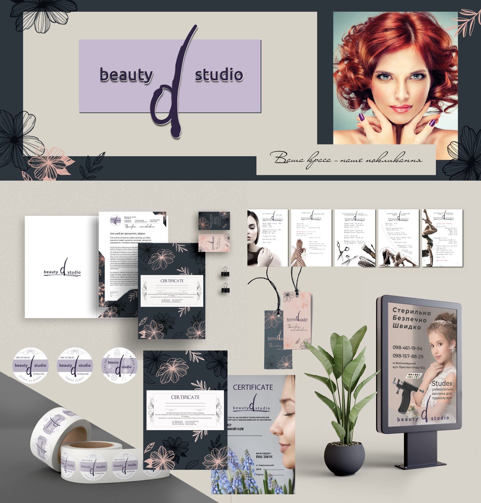
"Beauty_d_Studio" is a young brand that appeared on the market a few years ago.The task was to make it recognizable to the consumer.developed by:
1 .Constant style (logotype, firm colors, fonts, patterns)
The 2ndBusiness polygraphy (corporate visit card, business visit card, corporate form, flow, conversion, pre-scured)
3 .Advertising and souvenir products (click, package, label, calendar, gift certificate, training certificate)
and 4.Advertising (internal navigation communications, external information lifting, facade lifting, stender, banner, siteboard).The logo was designed for the beauty sphere, so it had to become laconic and delicate, pleasant for the eyes and easy to remember.The main font of the logo is selected without seats, it looks modern, transmits the desire for beauty and elegance.The distinctive recognized characteristics of the logo are a massive symbol with the English letter d, as if written with a pencil for makeup.For the brand, three main company colors are selected - the color of the lavender, silk-blue and cream-roze.When choosing colors, the emphasis was made on the expressions and advantages in the visual communication of the brand.In the combination of colors create a luxurious image, following which they come into the studio of beauty.Firm style is a powerful tool to create the desired image of the brand in the eyes of consumers.Colors, fonts, and logos help trigger emotions in the customer, trigger his confidence and interest.https://www.behance.net/gallery/163243007/logotipfrmovij-stilCorporate-style/modules/929191613
#Illustration #illustrator #vector #design #illustrator #vector #vector #vectorillustration #log #logotype #graphics #firma_style #external_advertising