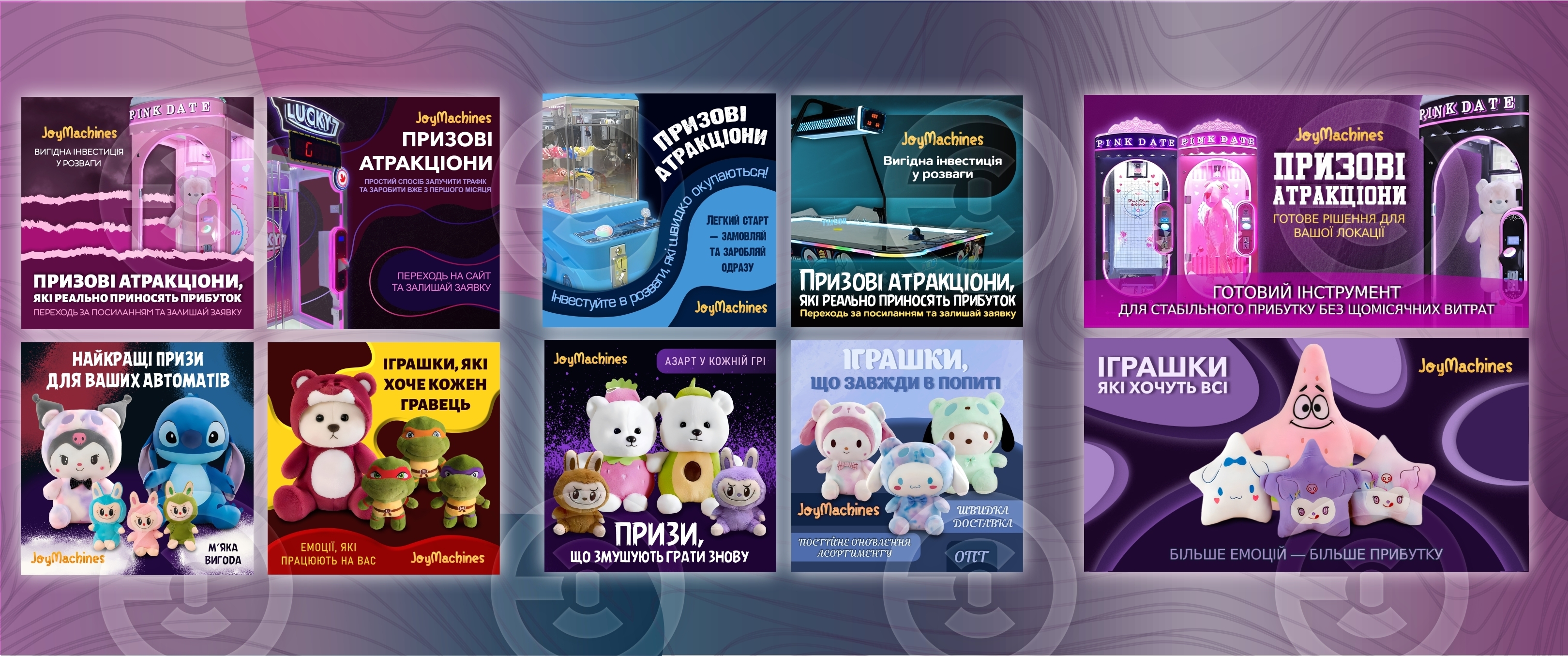
Smooth abstract forms have been used in a purple-pink and blue palette, associated with bright emotions, excitement, and a playful atmosphere. Background waves and patterns create a sense of movement that enhances the dynamics of the carousel. Bright and voluminous photos of attractions and prize toys serve as the main visual accents that immediately draw attention. Clear and contrasting typography that is easy to read in Google Ads advertising formats. Highlighting unique advantages — emphasis on quick profits, a refreshed assortment, and the emotions experienced by the player. The brand colors of JoyMachines are combined with rich neon and pastel tones, creating a modern and easily recognizable style. This carousel demonstrates a visual brand system focused on maximizing engagement and conversion in advertising campaigns, while also emphasizing a professional approach to creating promotional graphics for the entertainment industry.