Celuze
Logo Design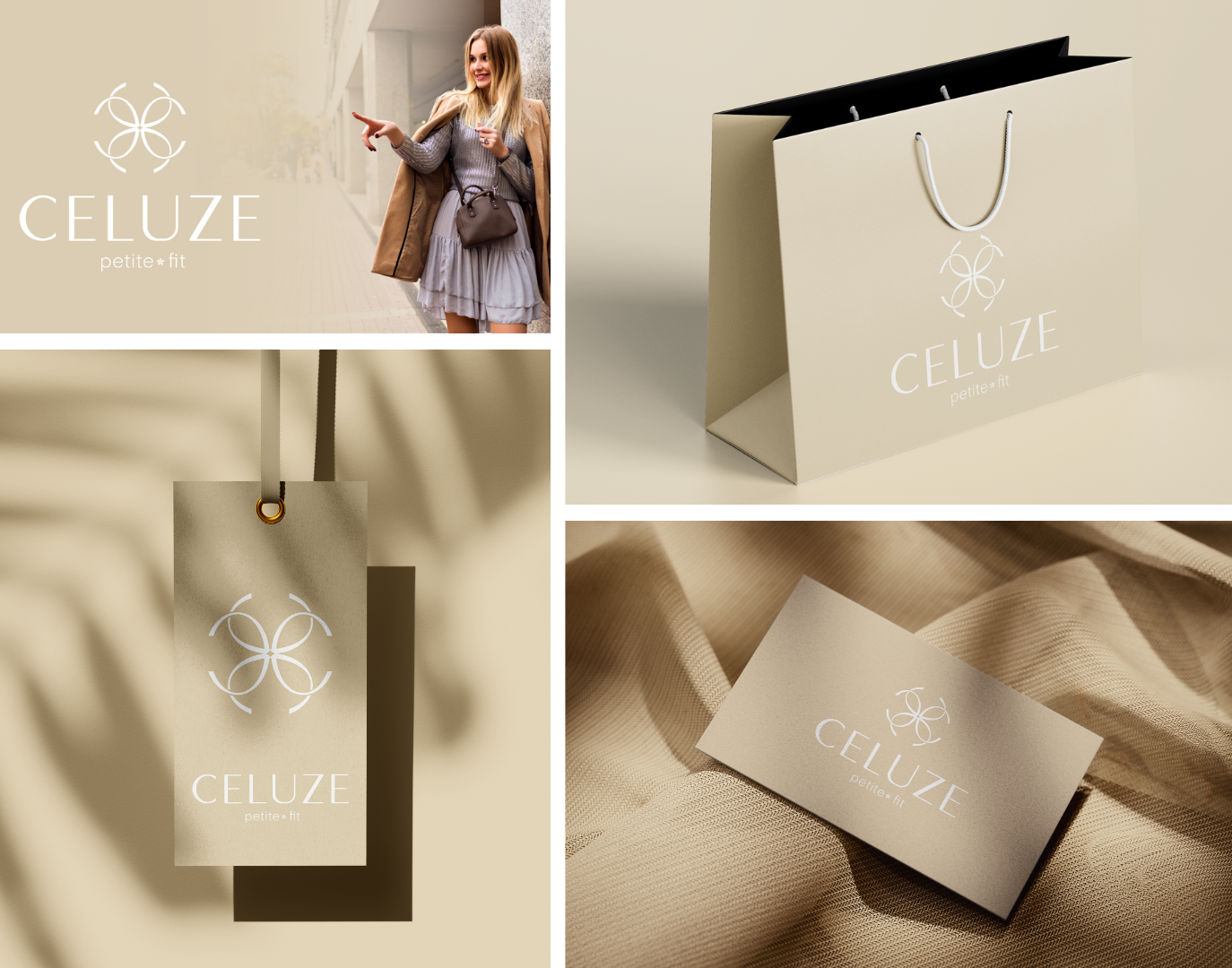
Development of a logo for the women's clothing brand CELUZE.
The logo embodies the idea of inner light, natural harmony, and elegant confidence, which corresponds to the essence of the brand — clothing for petite women. In the center of the composition is a stylized symbol created by duplicating four symmetrically arranged letters "C", forming a negative space image of a four-petaled flower, a subtle hint at naturalness, femininity, and lightness. In the center of the flower is an element in the shape of a sparkle, as a metaphor for inner light, energy, and sophistication, emitted by a woman in comfortable, body-adapted clothing.
The logo is built on a delicate combination of premium natural shades: sandy beige — symbolizing warmth, naturalness, and bodily comfort; pearl-milky, providing visual purity and lightness; and deep black for text and accents, adding graphic strength and expressiveness. These colors reinforce the brand's philosophy: delicacy in details, perfection in form, and harmony in every movement.
#logo #logo #designlogo #logotype #contests #logodesign #branding #design #graphic_design #orderlogo #football #sports_logo #emblem #logo #logotype #logodesign #Adobe_Illustrator #AdobeIllustrator #AdobeIllustrator #illustrator #Illustration #illustrations #freelancer #amateur_freelancer #freelance #logo #logotype #logodesign #Adobe_Illustrator #AdobeIllustrator #AdobeIllustrator #illustrator #Illustration #illustrations #freelancer #amateur_freelancer #freelance #Logo #Logotype #Minimalistic #Logodesign #Minimalism #creativedesign