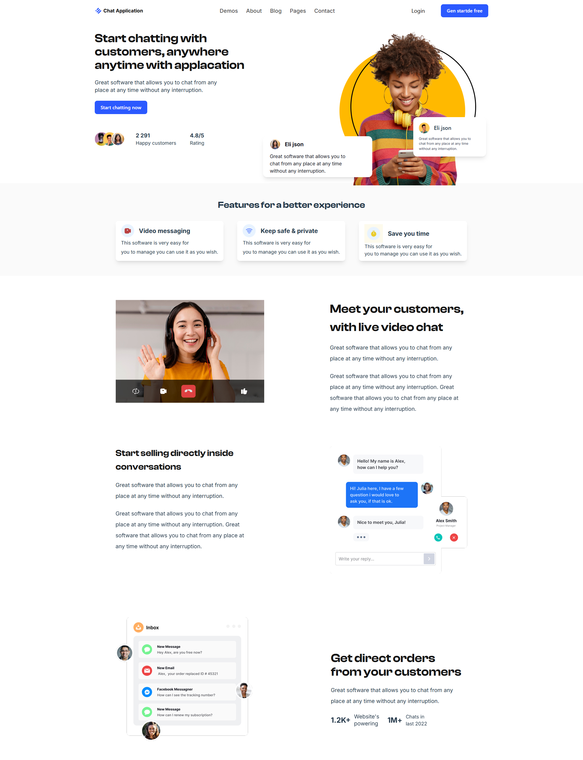
This is a fully responsive landing page for a hypothetical chat app. The project was built from scratch — from the structure to the smallest interface details. The main goal is to create a modern, lightweight, and animated web interface that looks equally good on all devices and emphasizes the product's value to the user.
What has been implemented:
Pixel-perfect layout according to the Figma design.
Responsive interface supporting all popular resolutions — mobile, tablets, desktop.
Stack: React · Tailwind CSS · Framer Motion · Responsive Design
Semantic HTML structure + ARIA attributes — for better accessibility and SEO.
Tailwind CSS — for quick, unified, and clean styling with custom classes.
Fixed header with animated burger menu that opens navigation and a CTA popup.
Footer with several sections: logo, navigation, policies, social media.
Animation with framer-motion on footer load and social icons appearance — to increase engagement.
Smooth class management of overflow-hidden when opening popups to prevent page shifts.
Validation of buttons and correct popup closing logic.
Main focus:
Quality of layout and adaptation logic
Visual consistency with UI
Smooth interaction with the interface (UX)
Code neatness and scalability
Result:
The page looks professional, does not "break" on any device, features pleasant animations, and easy navigation. It is a great example of clean, well-thought-out frontend that can be easily scaled.