COMOS
Logo Design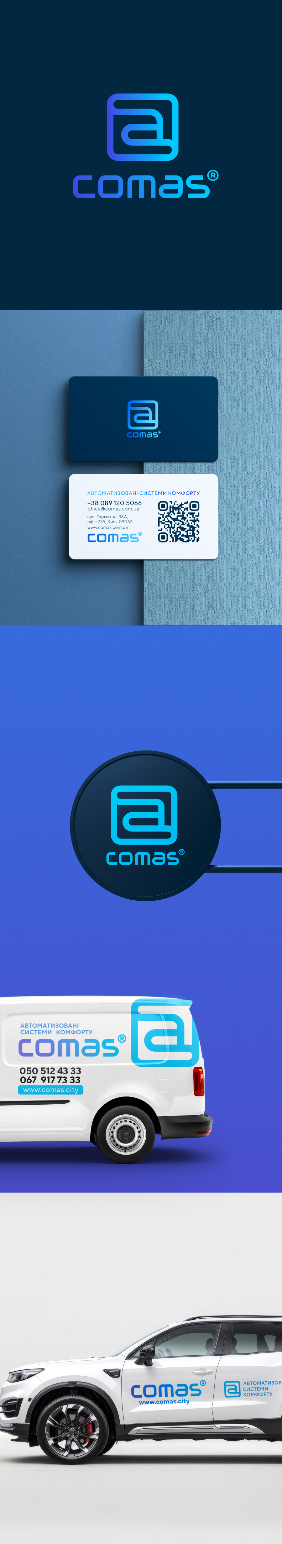
The logo's graphic symbol is a stylized form that integrates three letters: C, A, and S, which stand for Comfort Automated Systems.
The symbol is built as a single continuous outline within a square with rounded corners, symbolizing:
a complete integrated system that combines all engineering services in housing,
comfort and reliability, thanks to soft lines,
technological logic, through an association with diagrams, microprocessors, or digital streams.
This is a visual metaphor for how all automation processes work seamlessly and unobtrusively, creating an intelligent environment in a residential complex.
Font and inscription
The "comas" inscription is executed in a modern geometric font with rounded features, emphasizing:
friendliness and simplicity,
technological advancement and innovation,
the pursuit of convenient digital control.
A gradient from purple to blue enhances the sense of dynamics and a wide range of digital services.
Logo concept
The COMAS logo reflects the company's philosophy — creating a “smart,” automated space for comfortable and energy-efficient living.
The symbol encodes the main idea:
C — Comfort (resident comfort and safety)
A — Automated (automated solutions)
S — Systems (modern engineering systems)
The COMAS company operates in the PropTech field, implementing modern systems:
building automation, dispatching, control, monitoring, and analysis.
These solutions allow optimizing resource consumption, ensuring microclimate control, and providing remote management of all systems.