Conceptual identity for the Christian NGO "Ark of Hope for Youth." (competition work)
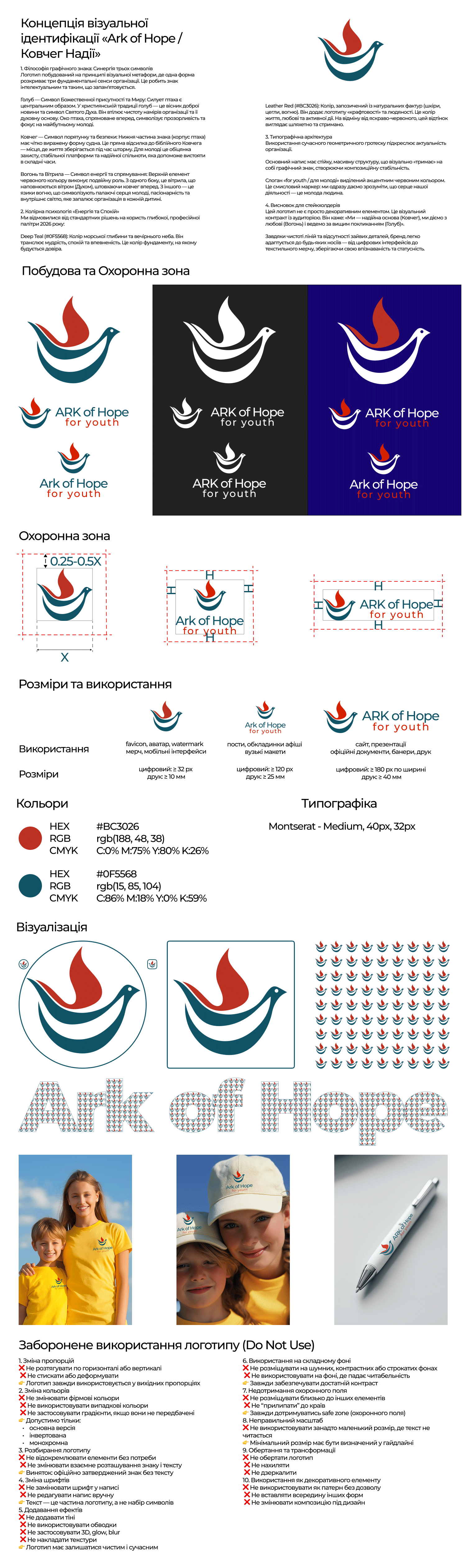
The basis of the sign lies in the method of geometric minimalism and working with negative space: the silhouette of a dove, symbolizing faith and peace, is organically integrated into the stable shape of the ark. The design balances between prestige for international donors and modern energy for the youth audience. Clean typographic hygiene and a "vitamin" color palette ensure excellent readability and brand recognition in digital and print environments.
#branding #identity #logodesign #graphicdesign #brandbook #visualidentity #identity #logo #branding #logodesign #minimalism #geometrics #negativespace #flatdesign #typography #branding2026 #modernlogo #minimalism #geometry #negativespace #arkofhope