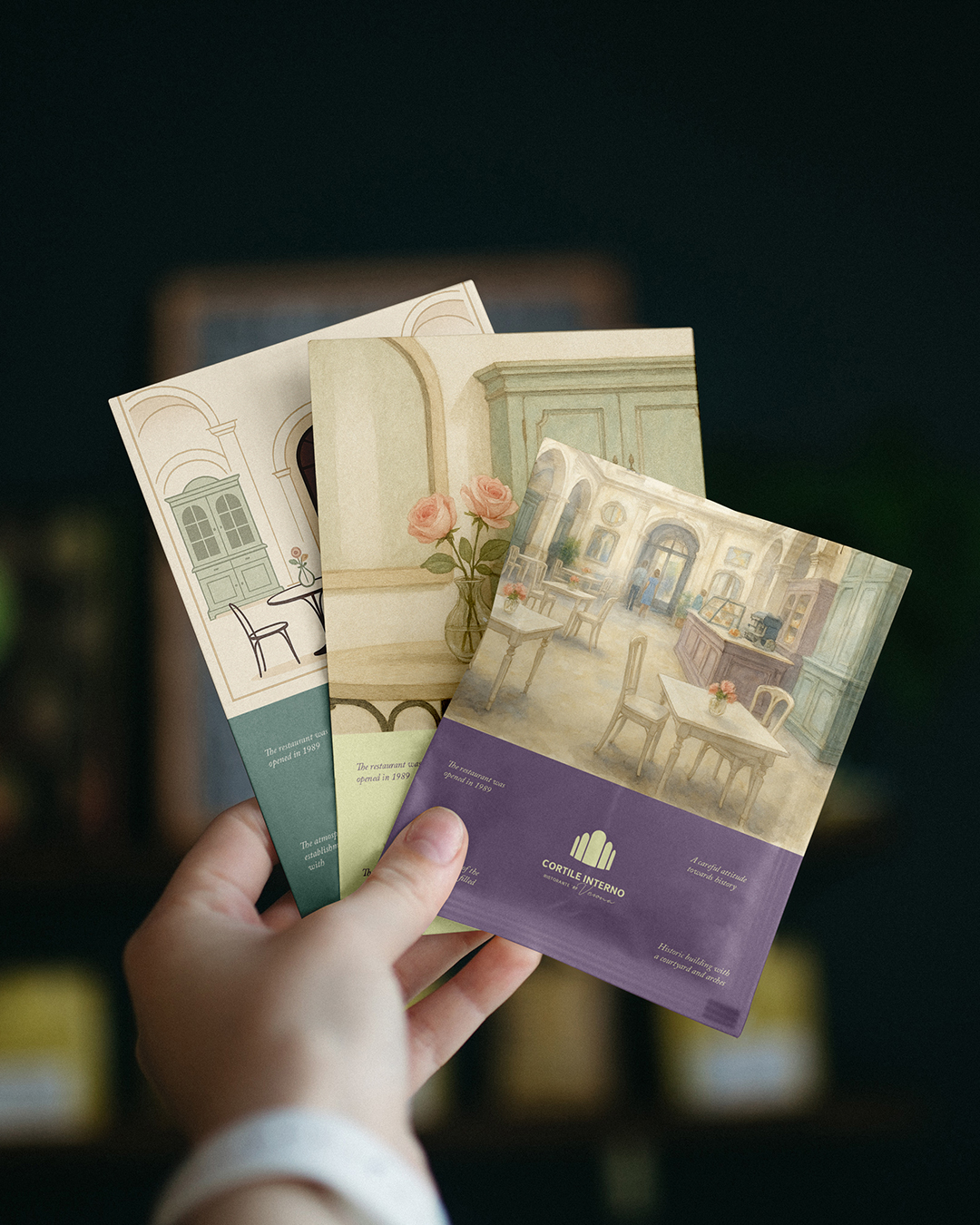
Identity for a restaurant in a historic building with a courtyard in Verona.
The project combines visual delicacy with respect for architecture, history, and light.
The logo is a stylized arch symbolizing space, heritage, and hospitality.
The font combination of classic and calligraphy emphasizes the brand's soul.
Palette: soft lavender, mint, cream — inspired by the interior and seasonal cuisine.
The interior idea and concept - light, arches, mirrors, and hand restoration create an atmosphere of unhurried elegance.
The identity is subtly integrated into the menu, print materials, packaging, and space.
Cortile Interno — is a visual language that sounds soft.
Quiet elegance
Balance between history and modernity
An atmosphere that one wants to preserve