Creation of a responsive website for an architectural and construction company from
HTML & CSS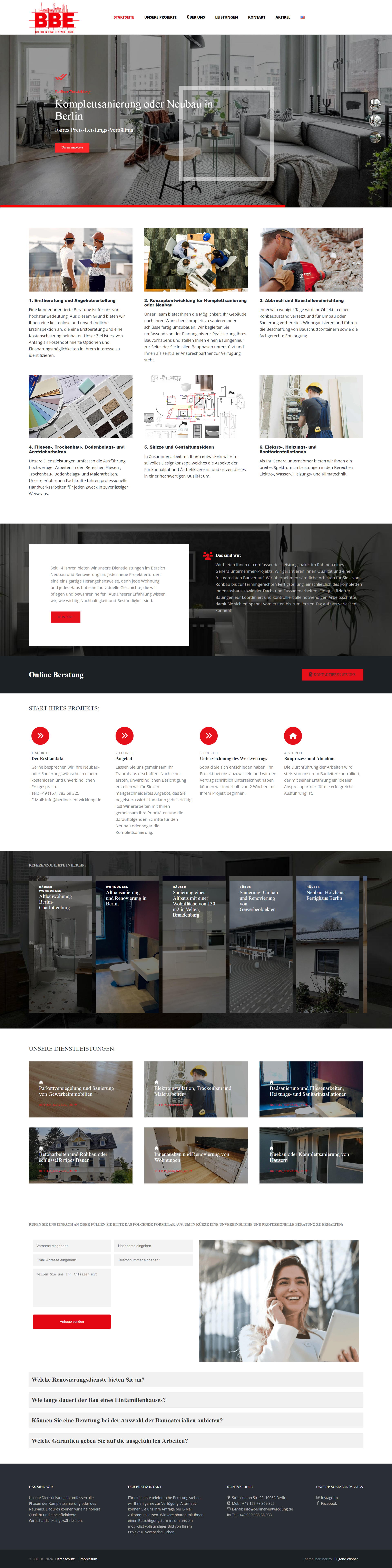
When creating a responsive website for an architectural and construction company, I paid attention to both aesthetics and functionality. The site was developed using HTML5 and CSS3, taking into account responsiveness for different devices — from mobile phones to large monitors. I used Flexbox and Grid to create complex layouts that adapt to any screens, and also added interactive elements in JavaScript to enhance user interaction with the site.