About the Project
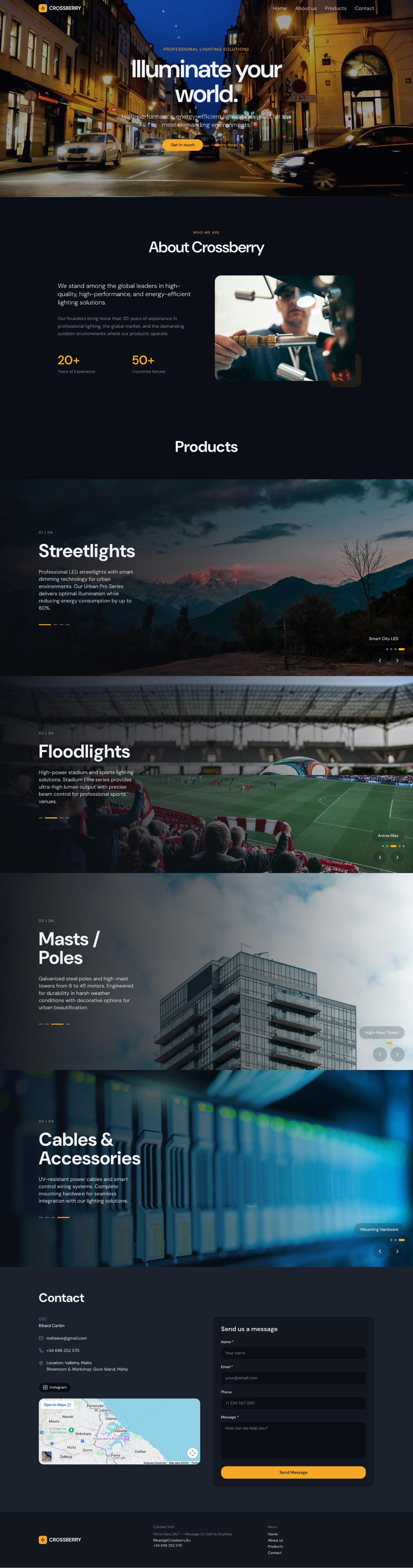
Crossberry is a corporate presentation website for a company that stands among the global leaders in high-quality, energy-efficient professional lighting solutions.
______________________________________________________________
Objective
To develop a clean and minimal website for the B2B segment (partners and clients). The main goal is to effectively and structurally showcase all product categories (streetlights, floodlights, masts, and cables) on a single page while ensuring a fully responsive design across all types of devices.
______________________________________________________________
Solutions (UX/UI)
Visual Concept: A dark, deep-blue and black color palette was chosen. This creates a premium atmosphere and provides a striking contrast with the realistic photos of the lighting equipment. Clean, readable fonts were used.
Structure (UX): All product categories are displayed on a single page. Using horizontal scrolling (sliders) for product cards eliminates unnecessary navigation and allows users to quickly explore the catalog visually.
Conversion: A clear call-to-action button (Contact us) is placed on the home screen, and a convenient feedback form is added to the contact section.
______________________________________________________________
Result
A stylish, fast, and responsive WordPress-based site that highlights the company's status and serves as an excellent tool for presenting turn-key solutions for infrastructure projects and sports arenas.