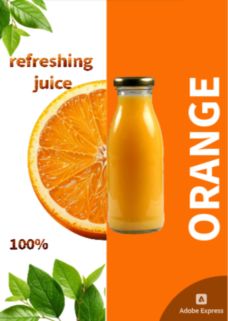
Development of a juicy and bright layout for advertising orange juice. The principle of visual hierarchy has been used for the correct distribution of accents. Creation of a contrasting two-color background to highlight the object. The layout is adapted for the format of stories and posts.