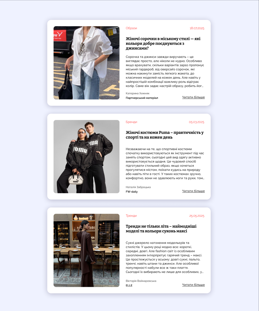
About the work:
I developed a minimalist design for a news block for a fashion publication. I focused on cleanliness, comfortable typography, and space to ensure the text is easy to read and the photos look like they belong in an expensive magazine.
What's inside:
A neat hierarchy: headline, category, date, and author.
A light theme with soft shadows for a layered effect.
A well-thought-out "Read more" button that does not overwhelm the design.
Result:
A ready module that easily fits into any blog or online store. Everything is structured, clear, and stylish.
Tools: Figma