Organization name
Red Planet Labs
Description of the organization and its target audience
We make advanced technology for building software.
Industry
Technology
Existing website
Unspecified
Visual style
Style/theme ideas
The color red should be used, but not overdone. The design should be serious and professional. Other than the logo, it should not be cartoony at all.
The attachment "nice-but-wrong-layout.png" is a mockup a friend made that has a visual style I really like. However, I can't use this because: the layout/content does not match what I need (home-page.pdf), it doesn't properly incorporate the logo, and the planet image is not desired.
Inspirational websites
https://stripe.com/
The design of the home page is very clean and sharp.
Content details
Page descriptions
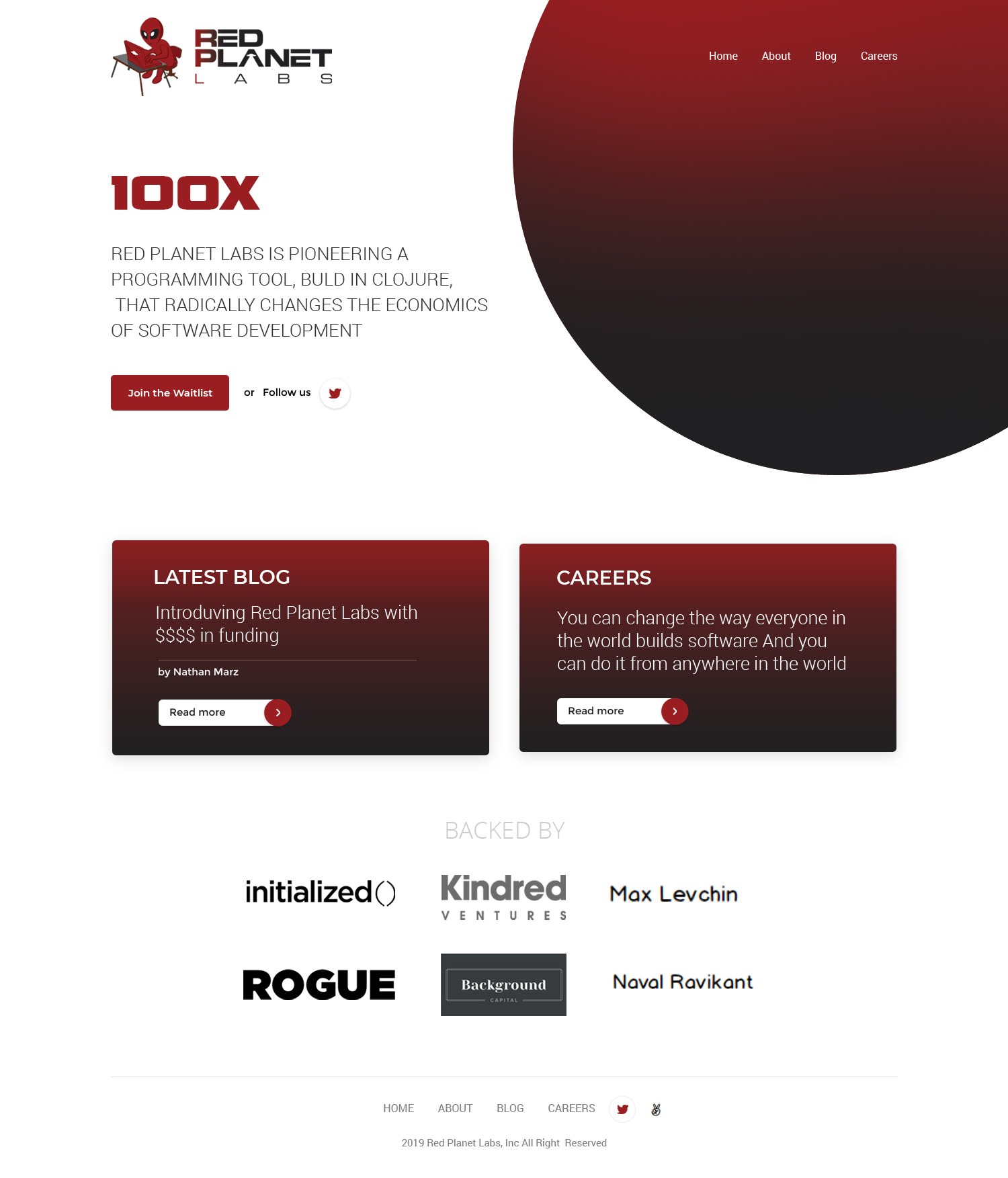
Home page: a mockup with the needed content is attached. Do not diverge from the content at all, and don't add any other images. What is up to you is styling – colors, backgrounds, borders, fonts, sizes, etc. The mockup presents an idea for styling (the red and grey backgrounds) – feel free to do something different as long as the content and overall layout remains the same.
About page: There should be a "Founders" section and an "Investors" section. "about.txt" contains the content.
Careers page: "jobs.txt" contains the content.
What to avoid
Do not use any images other than what's provided. That means no stock images, no random cartoons, etc.
On the home page do not add any content other than what's shown in the mockup.
Do not use a scroller of any sort for Backed by section on home page.
Red Planet Labs
Description of the organization and its target audience
We make advanced technology for building software.
Industry
Technology
Existing website
Unspecified
Visual style
Style/theme ideas
The color red should be used, but not overdone. The design should be serious and professional. Other than the logo, it should not be cartoony at all.
The attachment "nice-but-wrong-layout.png" is a mockup a friend made that has a visual style I really like. However, I can't use this because: the layout/content does not match what I need (home-page.pdf), it doesn't properly incorporate the logo, and the planet image is not desired.
Inspirational websites
https://stripe.com/
The design of the home page is very clean and sharp.
Content details
Page descriptions
Home page: a mockup with the needed content is attached. Do not diverge from the content at all, and don't add any other images. What is up to you is styling – colors, backgrounds, borders, fonts, sizes, etc. The mockup presents an idea for styling (the red and grey backgrounds) – feel free to do something different as long as the content and overall layout remains the same.
About page: There should be a "Founders" section and an "Investors" section. "about.txt" contains the content.
Careers page: "jobs.txt" contains the content.
What to avoid
Do not use any images other than what's provided. That means no stock images, no random cartoons, etc.
On the home page do not add any content other than what's shown in the mockup.
Do not use a scroller of any sort for Backed by section on home page.