Design of a promo email for the announcement of a new product (example)
Email Marketing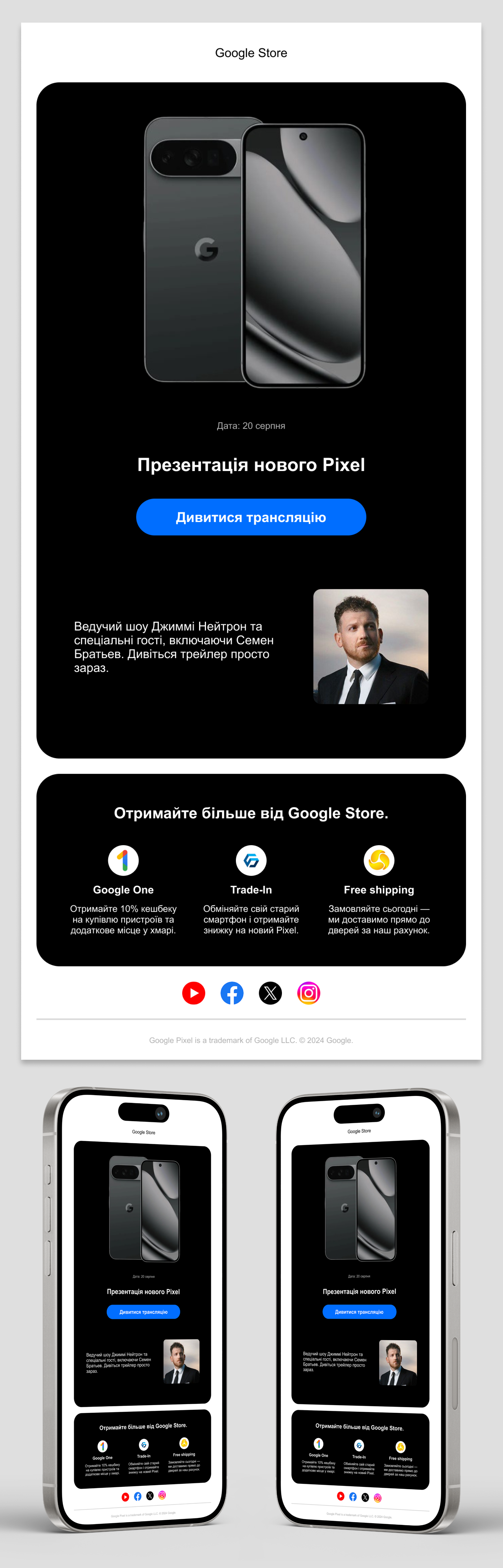
Task: Develop an email layout for announcing a large-scale presentation that will capture the user's attention and motivate them to watch the broadcast.
Solution: The design is based on the principles of minimalism and clear visual hierarchy.
- Focus on conversion: The central element of the first screen is the product and a contrasting call-to-action (CTA) button, which naturally draws the reader's gaze.
- Contrast and readability: The use of dark block cards on a neutral light background creates a premium look and allows for easy reading of information.
- Logical structuring: The email is divided into meaningful blocks — from the main announcement and show details to additional benefits of the ecosystem (cashback, trade-in, delivery). This prevents overwhelming the user with text while maintaining "air" in the layout.
The result is a modern, concise, and adaptive email layout that effectively addresses the marketing task.
#emaildesign #webdesign #emailmarketing #uidesign #uiux #figma #minimalism #promodesign #darktheme #cleanui #Newsletter