Design of the cover and guide layout
Presentations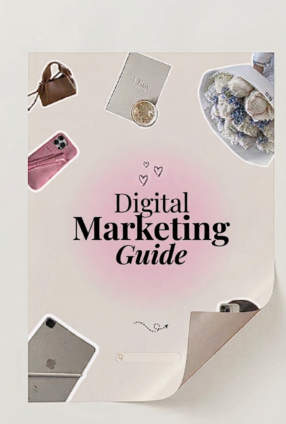
I developed the cover and internal design for a digital marketing guide. The main task was to immediately attract attention and instill trust in the material. For the cover, I chose a minimalist solution with a clear title so that potential readers could understand the value of the guide even before opening it.
In the internal sections, I focused on convenient navigation and clarity of presentation. No unnecessary noise, just a structure that guides the reader from the first page to the last effortlessly. I kept the colors subdued and calm, so the guide looks modern and professional while being easy to read from any screen.
As a result, it turned out to be not just a set of pages, but a cohesive working tool that is pleasant to use and not embarrassing to show to clients.