Design of the CROCS website
Interface Design (UI/UX)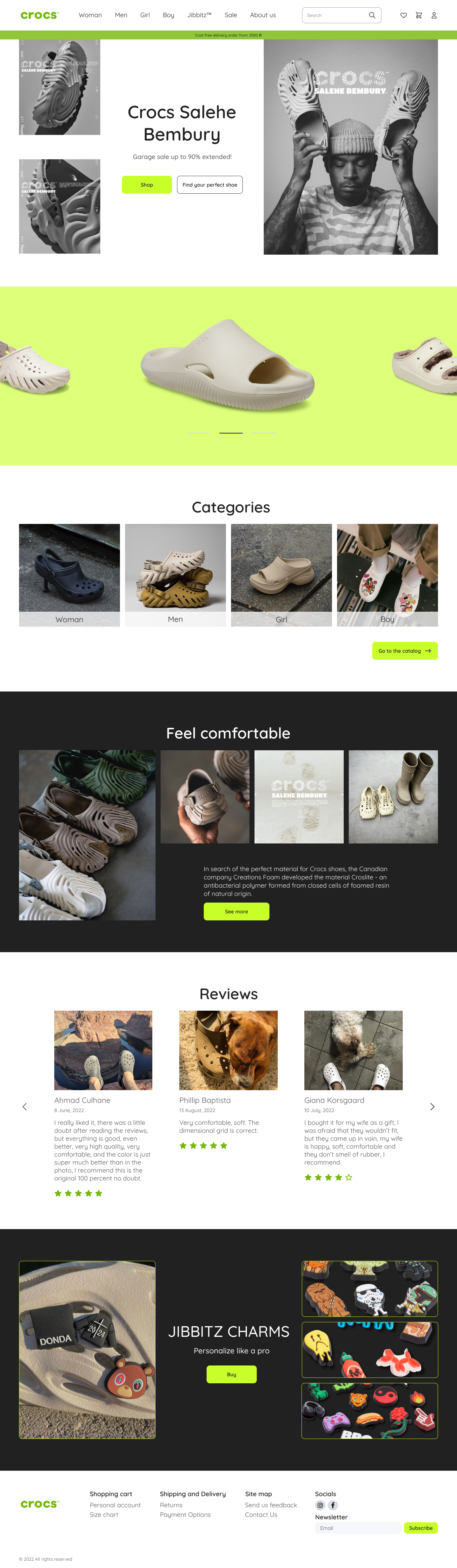
Working on the #redesign site #crocs, I put myself the task of working on the style of the site, so the icons, fonts, buttons looked more thorough and the visual part reflected the concept of the brand.
Why is this website vibrating?
Crocs is a pretty popular company that I use myself. When I saw their site, I was a bit shy because it doesn’t look aesthetically attractive, comfortable and modern, although it’s just so that it positions the brand.
The redesign of this site became one of my great objects, I developed 6 pages: headline, catalogue, page of goods, page about the company, page of payment and order.