Design of the crypto website and personal account VAELON
Interface Design (UI/UX)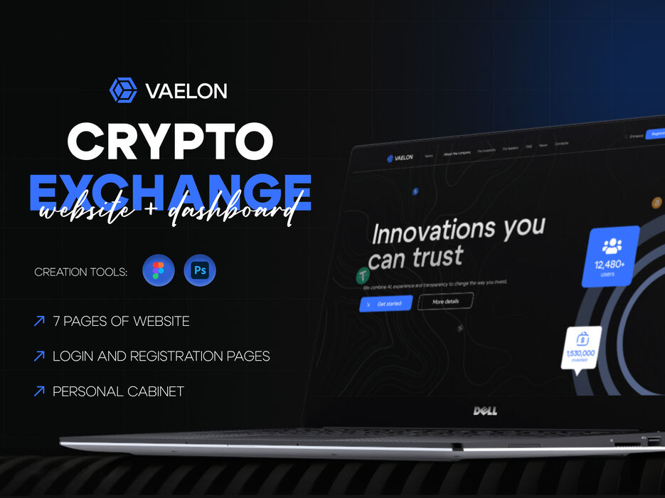
Problem
The current user experience was not clear and consistent enough, leading to difficulties, frustration, and user drop-offs at critical interaction points. Analysis of feedback and session data revealed challenges with navigation, weak content hierarchy, and a lack of a unified style across screens.
The main task was to identify pain points, simplify the user journey, and enhance overall usability.
Solution
UX Improvements
I optimized the user scenario and restructured the interface layout, making navigation more intuitive. Key interaction elements were redesigned to reduce friction and guide the user more naturally through the entire experience.
UI Improvements
A modern design system was implemented with improved spacing, contrast, and visual hierarchy. This made the interface cleaner, more accessible, and easier to perceive at first glance.
Link to the website: https://vaelon.net/