Design of the logo and firm style for calyan
Corporate Style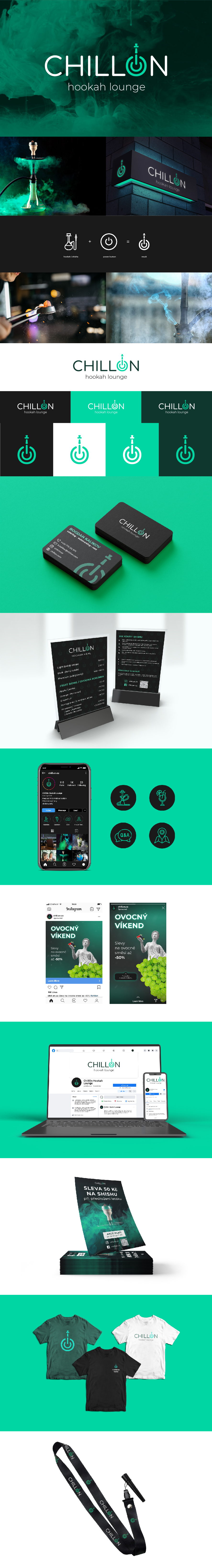
ChillOn is a place where everyone can relax with smoke potatoes, delicious cocktails and good music.
In addition to its own establishment, ChillOn also deals with outsourcing and catering of canyon service and rental.
I had the task of developing the logo and company style according to the customer’s brief.
Since the “ChillOn” name associates the “On” part with the injection/outjection, I decided to connect the power button with the calyan to one logo and put it in the name instead of the letter “O”.
As for the main color, the decision was made to use a thin shade, so it is associated with relaxation and chill.
As a font for the logo, Comfortaa was used to harmonize with the logo itself due to the fact that the font is round.