Design of the main page of the site
Web Design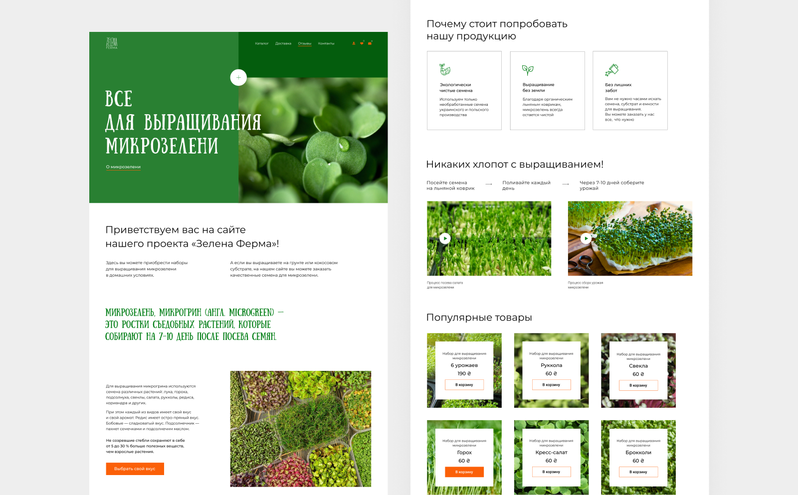
Redesign the main page of the site for the cultivation of micro-green.
The task I was trying to accomplish: to attract and retain the attention of the user + to bring to the purchase.
I conducted an analysis of competitors (both on the Ukrainian and Russian market) and came to the conclusion that quality photographs - decide. The manufacturer has a stylish product, but the guys are not frozen with the photos of their product. Therefore, on my website I used only goods photos. A lot of photos - saturated, juicy, causing the desire to try the green to taste.
For the first screen and accents, a font with mood was selected. It attracts attention (as a result, the user will read exactly what we have allocated).