Designing advertising banners
Banners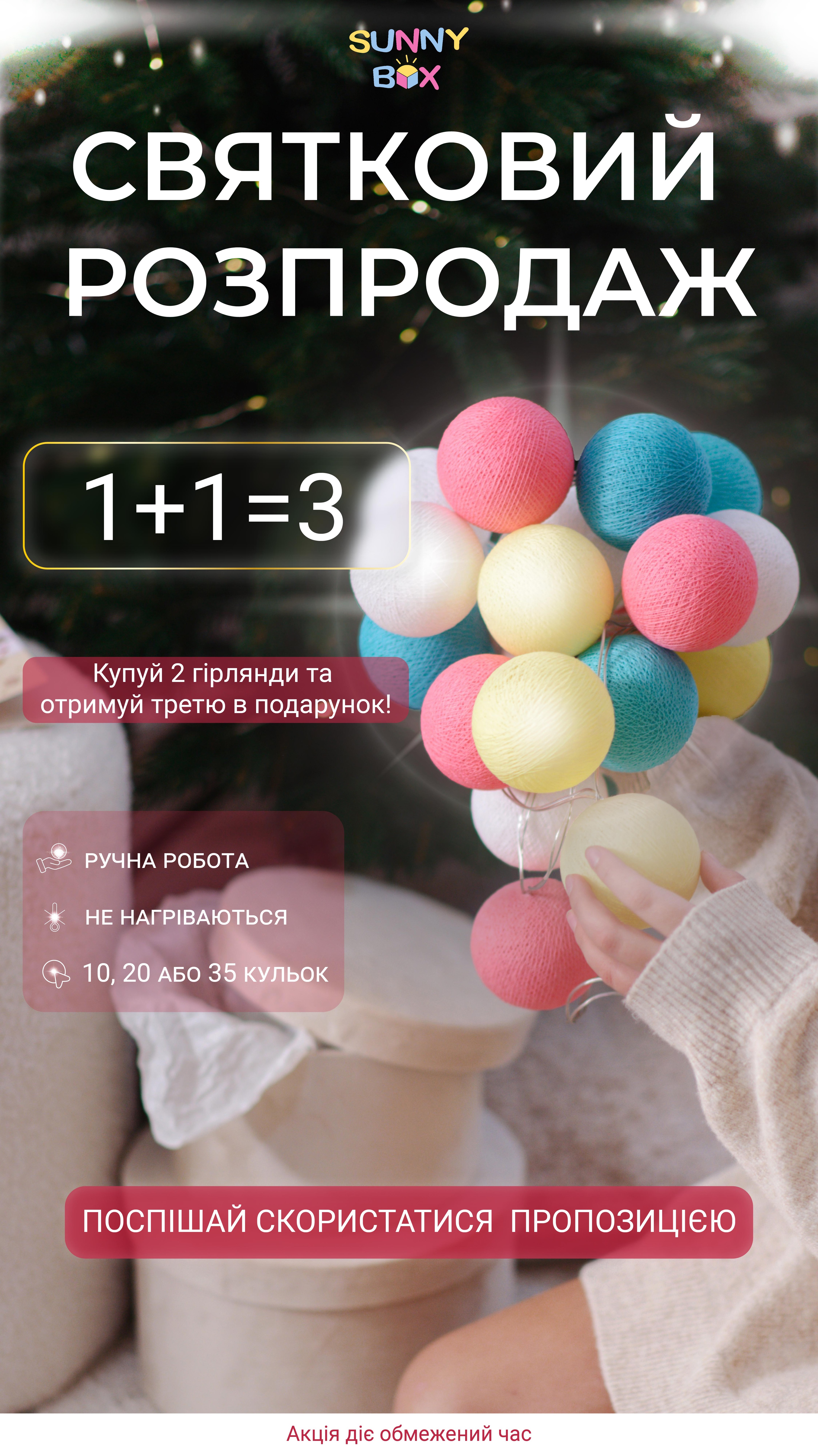
I tried not to overload the layout for better perception (to give more air) but used accents in the form of highlights, blurring for a festive atmosphere and the atmosphere of promotions (discounts). The boxes under the text are rounded and not sharp, reflecting goodness and coziness related to the brand! The outline is made with a golden gradient as this is a promotion (thus I tried to attract attention).