The development was based on:
Unique color palette: The use of deep gasoline and turquoise shades (as symbols of beginnings and harmony) combined with warm burgundy and raspberry accents (symbols of structure and life energy).
Deep symbolism: A shift from abstract geometry to more understandable, "kind" forms that evoke associations with protection and care.
Premium presentation: Placement on dark, textured backgrounds (warm wood, matte anthracite) to create an effect of elitism and trust.
Final set:
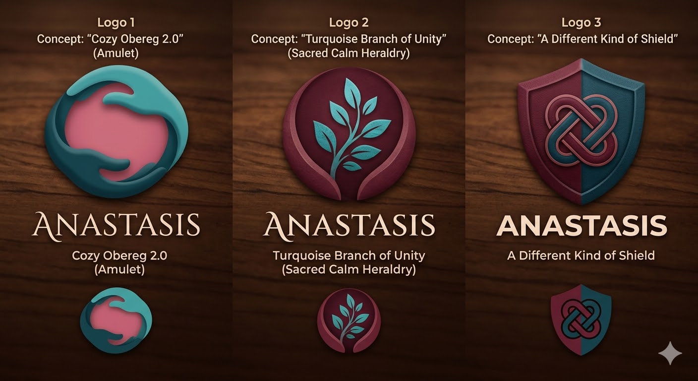
We developed three complete, distinct concepts:
"Gasoline Amulet 2.0": Abstract caring hands in the shape of a bowl — a symbol of unconditional support.
"Turquoise Branch of Unity": A clearly readable branch of rebirth surrounded by protective lines — a symbol of growth in the community.
"New Vision of the Shield": A classic coat of arms with soft geometry and a symbol of a protective knot in the center — a symbol of traditions and safety.
Flexibility of the solution:
At the client's request, I am ready to conduct a full customization of the chosen option:
Fonts: Changing the typeface (from delicate Serif to modern Sans-serif) to match the organization's tone.
Elements: Changing geometry, proportions, or adding descriptors (subheadings).
Colors: Fine-tuning the palette to meet the specific needs of the brand.
Unique color palette: The use of deep gasoline and turquoise shades (as symbols of beginnings and harmony) combined with warm burgundy and raspberry accents (symbols of structure and life energy).
Deep symbolism: A shift from abstract geometry to more understandable, "kind" forms that evoke associations with protection and care.
Premium presentation: Placement on dark, textured backgrounds (warm wood, matte anthracite) to create an effect of elitism and trust.
Final set:
We developed three complete, distinct concepts:
"Gasoline Amulet 2.0": Abstract caring hands in the shape of a bowl — a symbol of unconditional support.
"Turquoise Branch of Unity": A clearly readable branch of rebirth surrounded by protective lines — a symbol of growth in the community.
"New Vision of the Shield": A classic coat of arms with soft geometry and a symbol of a protective knot in the center — a symbol of traditions and safety.
Flexibility of the solution:
At the client's request, I am ready to conduct a full customization of the chosen option:
Fonts: Changing the typeface (from delicate Serif to modern Sans-serif) to match the organization's tone.
Elements: Changing geometry, proportions, or adding descriptors (subheadings).
Colors: Fine-tuning the palette to meet the specific needs of the brand.