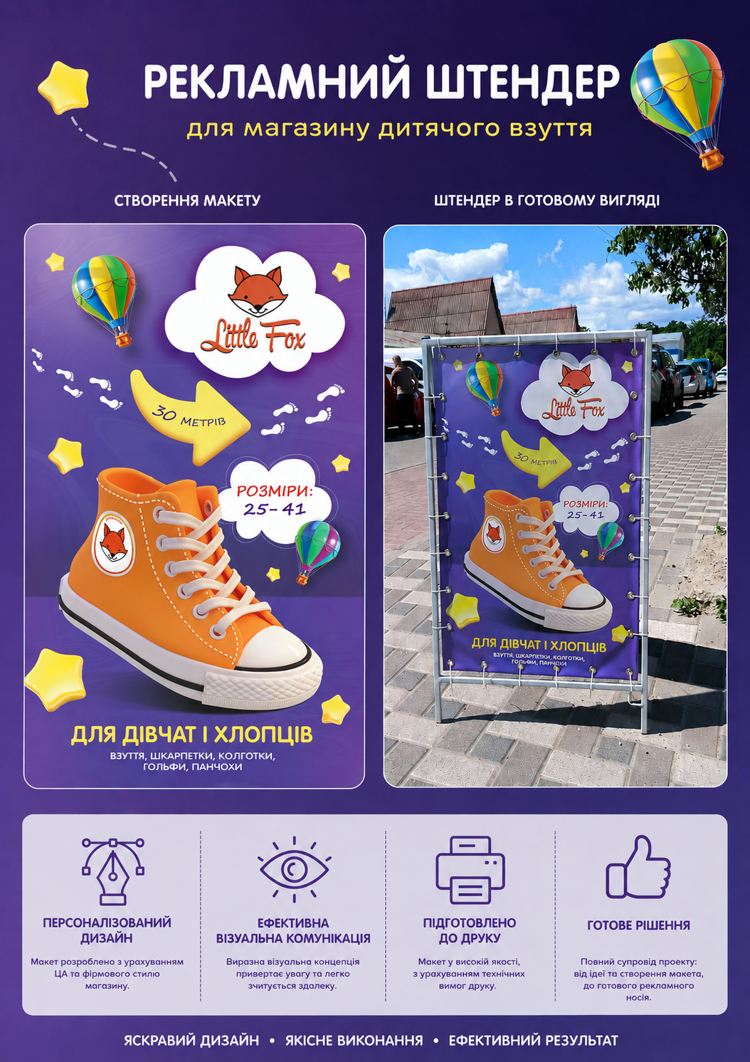
Project task: creating a layout for a promotional stand for a children's shoe store. Goal: to attract attention, quickly convey information about the assortment, and help navigate to the store's location. The layout should include the brand's signature colors (white and orange), information about what is being sold and for whom, as well as a directional indicator to the store. It was important to ensure good readability from a distance and visibility in an urban environment.
For the background, I chose a purple gradient: it does not blend in with the surroundings in different seasons and harmoniously combines with the orange elements of the brand style. An image of a sneaker in the center immediately indicates the store's specialization and emphasizes the modernity of the assortment.
The layout is prepared for printing on banner fabric with eyelets around the perimeter.
#outdooradvertising #layouts #banners