KHOLOD — development of a logo and brand identity for an ice cream brand.
The task was to create a modern and recognizable style that is associated with cold, freshness, and purity.
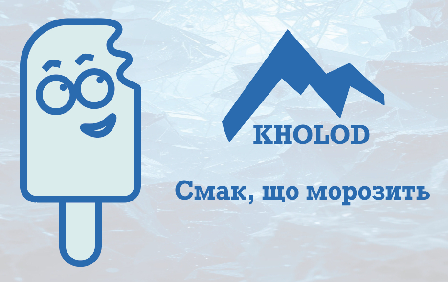
The project implemented:
A logo in several variations (color and monochrome), built on the basis of mountain shapes — a symbol of cold and crystal purity.
A corporate color palette (shades of blue, gray, and light blue) that creates a sense of coolness.
Patterns stylized as ice and mountains, which are used in the corporate identity.
Examples of application: business cards, ice cream packaging, branded materials, point of sale design.
Additional elements — illustrations and adaptive variations of the logo for different products.
The final result — a modern identity that helps the KHOLOD ice cream brand stand out among competitors and creates a strong association with cold and freshness.
#logo #branding #identity #packagingdesign #graphicdesign #icecream
The task was to create a modern and recognizable style that is associated with cold, freshness, and purity.
The project implemented:
A logo in several variations (color and monochrome), built on the basis of mountain shapes — a symbol of cold and crystal purity.
A corporate color palette (shades of blue, gray, and light blue) that creates a sense of coolness.
Patterns stylized as ice and mountains, which are used in the corporate identity.
Examples of application: business cards, ice cream packaging, branded materials, point of sale design.
Additional elements — illustrations and adaptive variations of the logo for different products.
The final result — a modern identity that helps the KHOLOD ice cream brand stand out among competitors and creates a strong association with cold and freshness.
#logo #branding #identity #packagingdesign #graphicdesign #icecream