eCommerce Website | UI/UX Design
Web Design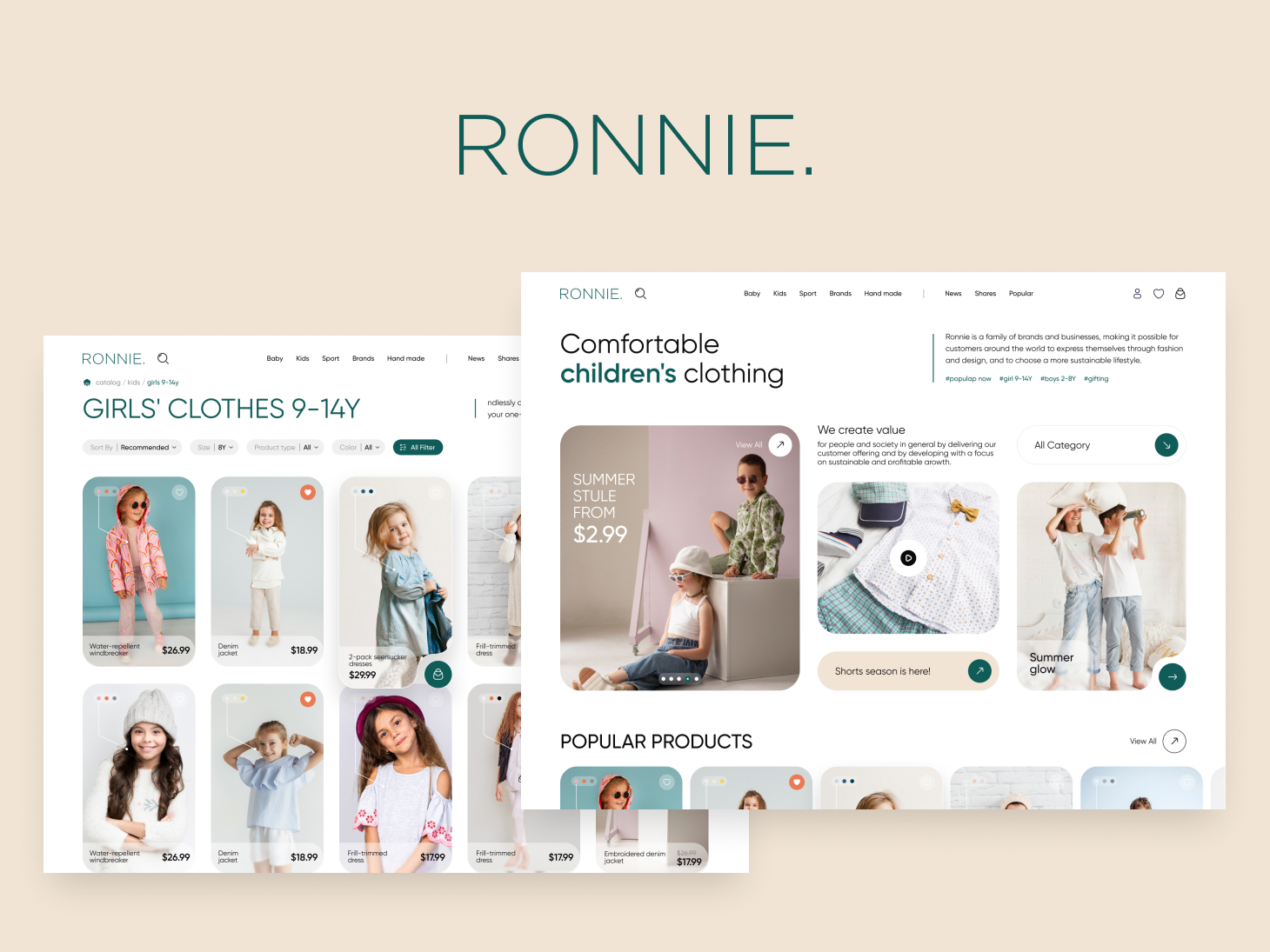
The task
Develop the design of an online children's clothing store using the principles of UI/UX design.
Ronnie - online store dedicated to children's clothing from newborns to teenagers, was conceived with a designer's passion for creating a beautiful, thoughtful, and convenient user experience.
The UI design was carefully crafted with a color palette that exudes warmth and comfort, utilizing light colors such as Vanilla Beige (#F1E4D4) for a pleasant and soothing user experience. To add a touch of vibrancy and guide users to take action, we incorporated an accent color, Opal Green (#0F5C58), for CTA buttons. This not only enhances the visual appeal but also ensures that users are intuitively directed to key interactions.
After deep research into common e-commerce practices, we organized the catalog into categories, showcasing popular items and highlighting new arrivals. This structure aids users in effortlessly navigating the diverse range of children's clothing available on the website. The website provides a detailed filtering system to simplify the search process for users, making it easy for them to find the perfect item.
The detailed item pages follow a clean and light design philosophy, allowing users to quickly access all the information they need and complete their purchase in just a few clicks.
The design embraces the current trend of using a light-style UI with rounded corners for elements. This modern aesthetic not only aligns with current design preferences but also enhances the overall visual appeal of the website.