Examples of a web site on Bootstrap3
HTML & CSS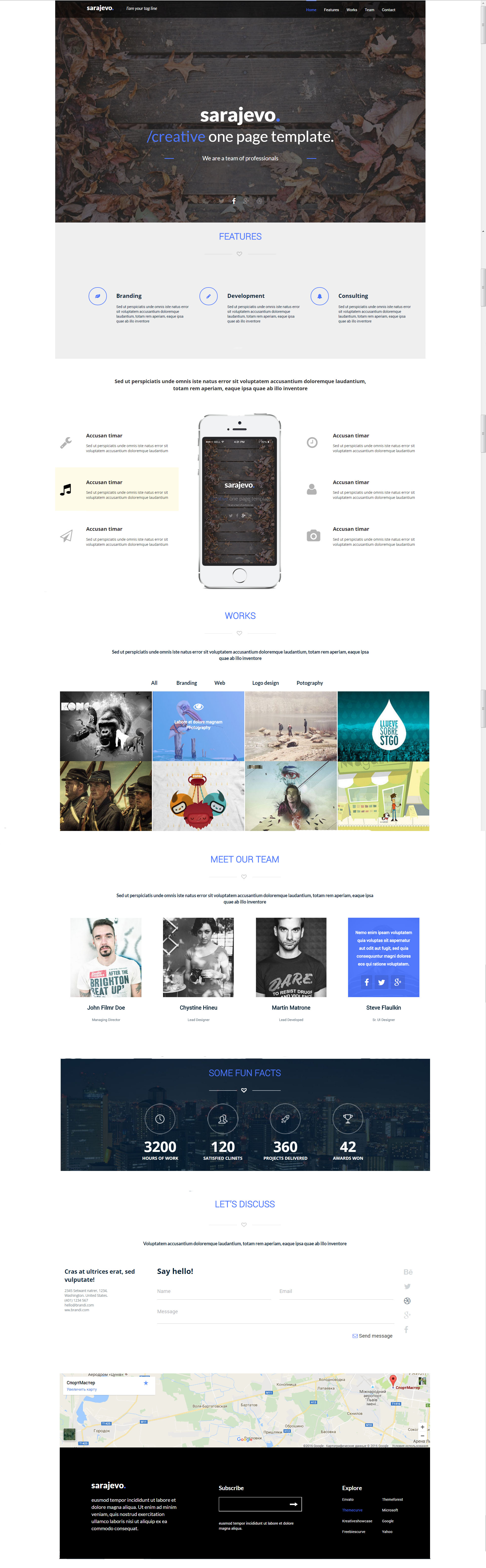
Adaptive wire on Bootstrap3.The menu turns into a hamburger, but it’s not Boot, but self-written.Many elements are semi-transparent by default, when inclined they become bright.The feature block with a mobile image is adapted as follows: on the tablets the inscription is on the left, and the phone on the right, on the mobile devices the image of the phone from the top, and everything else under it.When we turn to work in the portfolio we get a semi-transparent darkness with an eye image, project name and category.The team block when linking to the specialist appears a darkness with short information and network links to his profiles for transition.The form of feedback: if the field is correctly filled, a green hole appears on the right, incorrectly - a red scratch sign.The Google map is adjusted to the screen size, keeping the design proportions, while the minimum height of the element is set for mobile devices (so that the map is not striped).The width of the site varies between 360px and 1160px.