Concept - a brand that combines family traditions of winemaking and modern identity.
The main idea is to convey authenticity, heritage, and the taste of the vineyard while maintaining a sense of premium quality.
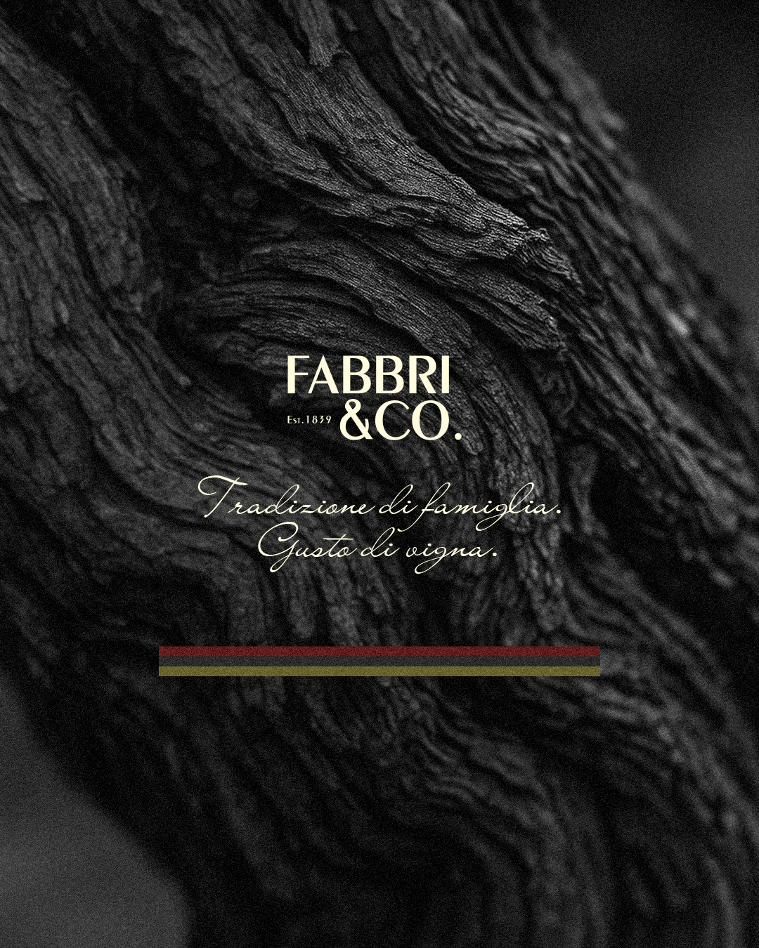
Visual identity - a classic logo with an emphasis on "& Co." - a symbol of heritage.
The slogan "Tradizione di famiglia. Gusto di vigna." - family heritage and the taste of the vine.
Palette - burgundy, olive, beige, black - reflects wine, earth, sun, and grapes.
The combination of strict and calligraphic fonts creates a balance of elegance and warmth.
Visual materials - atmospheric photos of vineyards and wood textures. A combination of black-and-white classics and color accents. Subtle graphic elements in the colors of the Italian flag.
Interior and architecture - minimalism with soft organic shapes and light textures. Arches and rounded windows - an allusion to wine cellars. Dynamic LED lighting as a symbol of the brand's vibrant energy. The simplicity of the facade integrates the brand into the natural landscape of the vineyard.
Identity details -
Staff uniforms in a restrained palette with the logo.
Branded tableware with the logo and slogan.
A holistic brand experience: from graphics to architecture.
Result - Fabbri & Co. forms a harmonious brand image where:
tradition meets modernity;
the vineyard becomes part of the visual language;
every detail emphasizes authenticity and premium quality.
The main idea is to convey authenticity, heritage, and the taste of the vineyard while maintaining a sense of premium quality.
Visual identity - a classic logo with an emphasis on "& Co." - a symbol of heritage.
The slogan "Tradizione di famiglia. Gusto di vigna." - family heritage and the taste of the vine.
Palette - burgundy, olive, beige, black - reflects wine, earth, sun, and grapes.
The combination of strict and calligraphic fonts creates a balance of elegance and warmth.
Visual materials - atmospheric photos of vineyards and wood textures. A combination of black-and-white classics and color accents. Subtle graphic elements in the colors of the Italian flag.
Interior and architecture - minimalism with soft organic shapes and light textures. Arches and rounded windows - an allusion to wine cellars. Dynamic LED lighting as a symbol of the brand's vibrant energy. The simplicity of the facade integrates the brand into the natural landscape of the vineyard.
Identity details -
Staff uniforms in a restrained palette with the logo.
Branded tableware with the logo and slogan.
A holistic brand experience: from graphics to architecture.
Result - Fabbri & Co. forms a harmonious brand image where:
tradition meets modernity;
the vineyard becomes part of the visual language;
every detail emphasizes authenticity and premium quality.