Firm style for the Zakarpatic tea company, which reflects
naturality, ecologicality and uniqueity of the product.
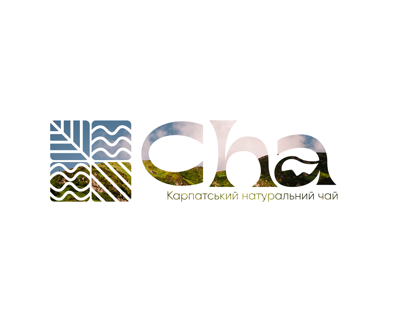
The logotype:
The logo contains the image of the Carpathians, and the mountains, which are a key element, the forest reflects the naturality and ecologicality of the product, the sun and the river, which emphasize the energy and heat of nature.
The Colors:
Green: ecological and fresh.
A red shade: naturality, earth.
Yellow: reflects solar rays, heat.
The Blue: Energy
The packaging:
Environmental packaging products. Processed materials and neutral and earth-colored colors are used. Added a label with a picture of a rosacea, melissa, tea triangle and flowers of a cushion.
#logotype #firma_style #package #Aidentika #creatives #banner
naturality, ecologicality and uniqueity of the product.
The logotype:
The logo contains the image of the Carpathians, and the mountains, which are a key element, the forest reflects the naturality and ecologicality of the product, the sun and the river, which emphasize the energy and heat of nature.
The Colors:
Green: ecological and fresh.
A red shade: naturality, earth.
Yellow: reflects solar rays, heat.
The Blue: Energy
The packaging:
Environmental packaging products. Processed materials and neutral and earth-colored colors are used. Added a label with a picture of a rosacea, melissa, tea triangle and flowers of a cushion.
#logotype #firma_style #package #Aidentika #creatives #banner