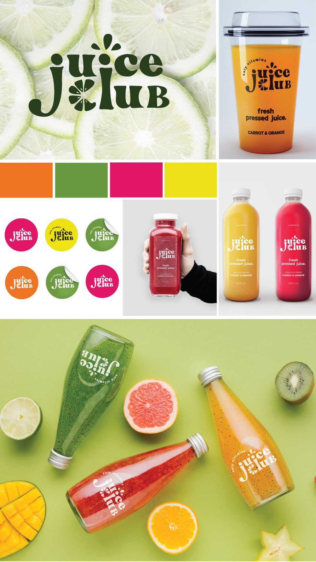
This composition of letters is used in the logo to make it interesting.
The retro font is used to emphasize that the juice is designed for different ages of consumers. Drops symbolize the splashing of juice during the juice squeezing process.
Orange slices are used to stylize the letter "C".
Such a composition of letters is used in the logo to make it interesting.
The retro font is used to emphasize that the juice is intended for different age groups of consumers.
Drops symbolize the splashing of juice during the juice extraction process.
Orange slices are used in stylizing the letter "C".
The retro font is used to emphasize that the juice is designed for different ages of consumers. Drops symbolize the splashing of juice during the juice squeezing process.
Orange slices are used to stylize the letter "C".
Such a composition of letters is used in the logo to make it interesting.
The retro font is used to emphasize that the juice is intended for different age groups of consumers.
Drops symbolize the splashing of juice during the juice extraction process.
Orange slices are used in stylizing the letter "C".