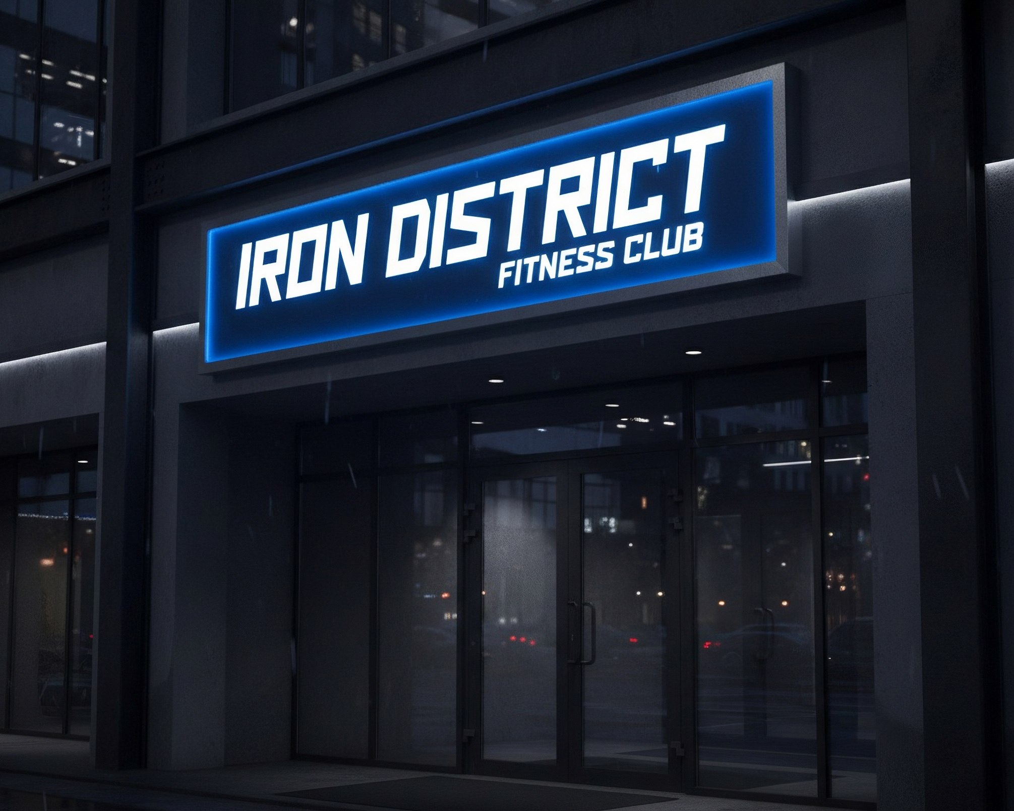
The basis of the style is a rectangular font developed from scratch specifically for this project. Due to its shape and tilt, it immediately conveys a sports theme, the dynamics of rhythm, and the "brutality" of the establishment. From the elements of the inscription, a logo was created in the form of a minimalist image of a kettlebell, intended for use on social media and printing on merchandise.
In addition to the already classic monochrome palette for this industry, a rarer blue color was used. This was done to create a unique design code and greater contrast compared to other sports clubs.
Adhering to the established rules regarding shapes and colors, all other branding elements were implemented, including corporate markers, icons, and other informational carriers.
In addition to the already classic monochrome palette for this industry, a rarer blue color was used. This was done to create a unique design code and greater contrast compared to other sports clubs.
Adhering to the established rules regarding shapes and colors, all other branding elements were implemented, including corporate markers, icons, and other informational carriers.