Brand style for the digital/freelance ecosystem inFLOW
Logo Design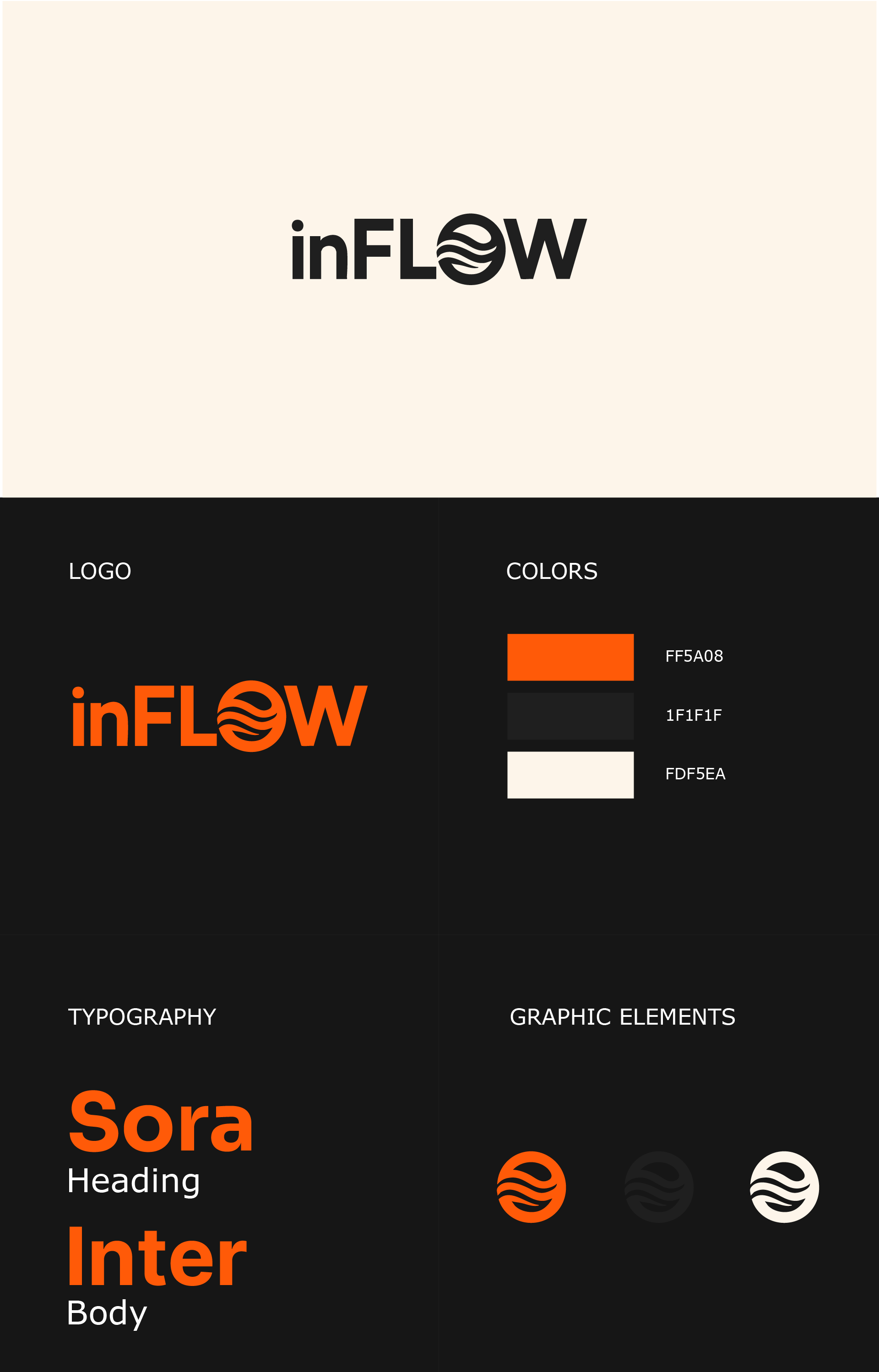
inFLOW — it's about the state of flow, clarity, and moving forward.
It's not just a brand, but a space where ideas, knowledge, and energy flow naturally, powerfully, and with focus.
Symbolism:
• “O” in the shape of a circle with waves — a metaphor:
• The flow of ideas and inner harmony.
• Energy without barriers.
• Balance and sustainable movement.
• “in” — as an entrance to the flow: you are inside, not observing — participating.
• The shape and font — strict, geometric, technological. This is about structure and digital thinking.
Colors:
• Orange — creativity, energy, rhythm.
• Black — strength, confidence, status.
• Milky white — warmth, liveliness, the human face of the brand.
It's not just a brand, but a space where ideas, knowledge, and energy flow naturally, powerfully, and with focus.
Symbolism:
• “O” in the shape of a circle with waves — a metaphor:
• The flow of ideas and inner harmony.
• Energy without barriers.
• Balance and sustainable movement.
• “in” — as an entrance to the flow: you are inside, not observing — participating.
• The shape and font — strict, geometric, technological. This is about structure and digital thinking.
Colors:
• Orange — creativity, energy, rhythm.
• Black — strength, confidence, status.
• Milky white — warmth, liveliness, the human face of the brand.