Brand style for the coffee shop
Blue Cup is a third-wave coffee shop where a cup of coffee becomes a small daily ritual. It is a place to pause: between tasks, routes, errands, and city noise. Here, coffee is not "fuel for survival," but a delicious and sensual part of life. The main character of the brand is the cup itself. Friendly, simple, a bit thoughtful. It does not rush, does not hurry, does not pressure. It reminds: "First breathe. Then take a sip. And everything will be fine."
Design Solution
I needed to create a visual identity that:
- conveys mindfulness without pretentiousness;
- feels homey, yet modern;
- warm, but not "sweet";
- simple, yet thoughtful.
In other words, the logo and style had to say:
"It is cozy and understandable here. Here you can be yourself" — even before a person tries the coffee.
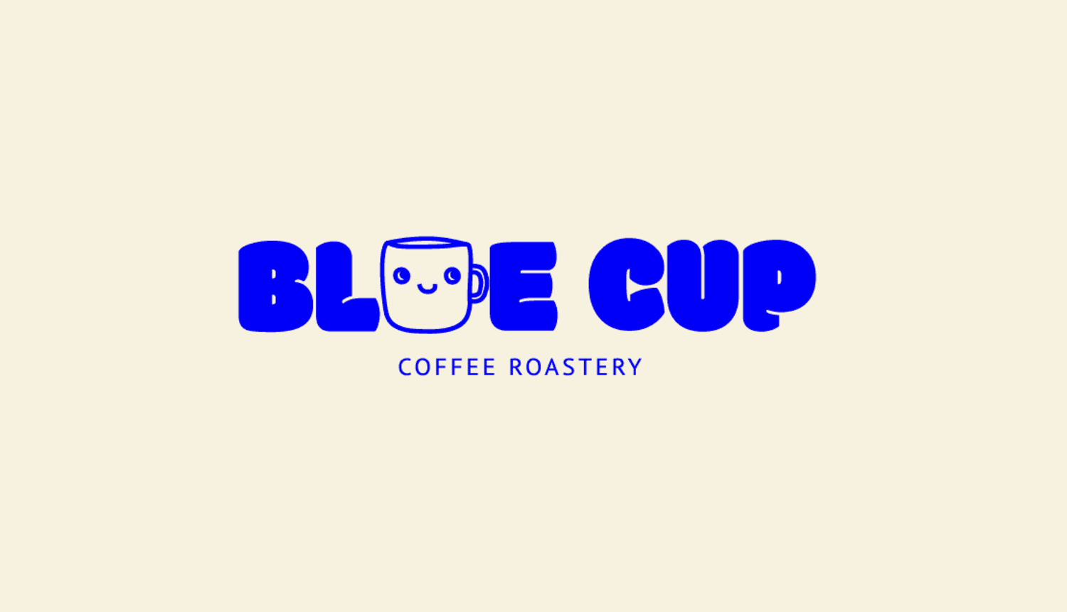
Typography
The main font is Modak. Soft, rounded, a bit naive — it provides just the right warmth. No sharp angles, aggression, or pompousness.
The additional font is Arial. Clear, structured, restrained. It balances the warm part and shows: "We still care about quality, about the beans, about the taste." Together they work as a dialogue: emotion + professionalism.
Design Solution
I needed to create a visual identity that:
- conveys mindfulness without pretentiousness;
- feels homey, yet modern;
- warm, but not "sweet";
- simple, yet thoughtful.
In other words, the logo and style had to say:
"It is cozy and understandable here. Here you can be yourself" — even before a person tries the coffee.
Typography
The main font is Modak. Soft, rounded, a bit naive — it provides just the right warmth. No sharp angles, aggression, or pompousness.
The additional font is Arial. Clear, structured, restrained. It balances the warm part and shows: "We still care about quality, about the beans, about the taste." Together they work as a dialogue: emotion + professionalism.
 Ukraine