Flour House
Flour House aims to ensure that every customer receives only the best product that brings satisfaction and is beneficial for health.
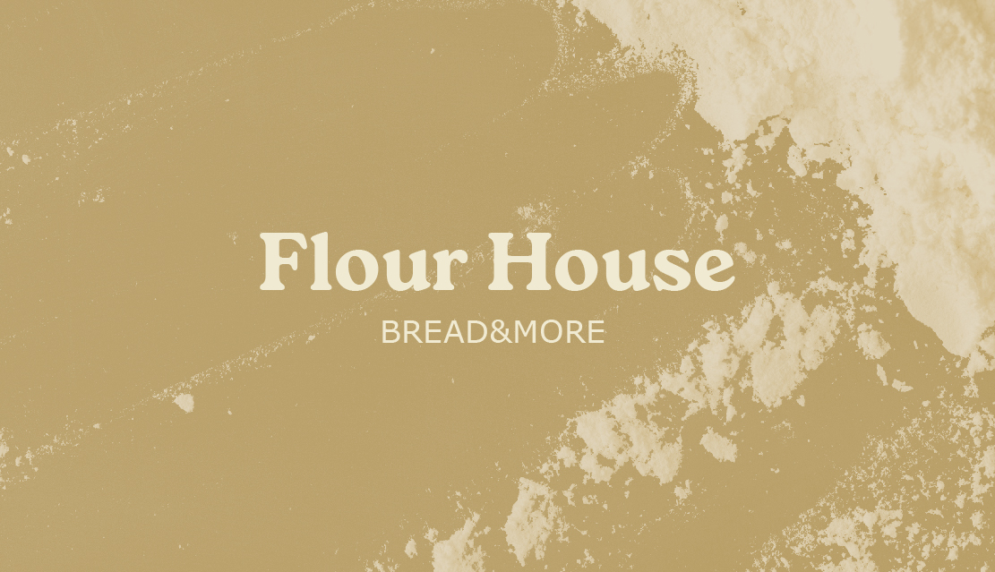
The objective of the project was to create an effective and attractive graphic image for the brands of bakery, as well as the development of visual elements that will transmit uniqueity and raise consumer confidence.
For the company was chosen a font version of the logo, which reflects reliability, minimalism, modernity and ecologicality.
The fonts used to create a logo have clear lines, are excellently read and emphasize its quality and professionalism.
It has also been selected a color palette, which transmits the feeling of freshness, naturality and quality of the product.
 Kyiv
Kyiv