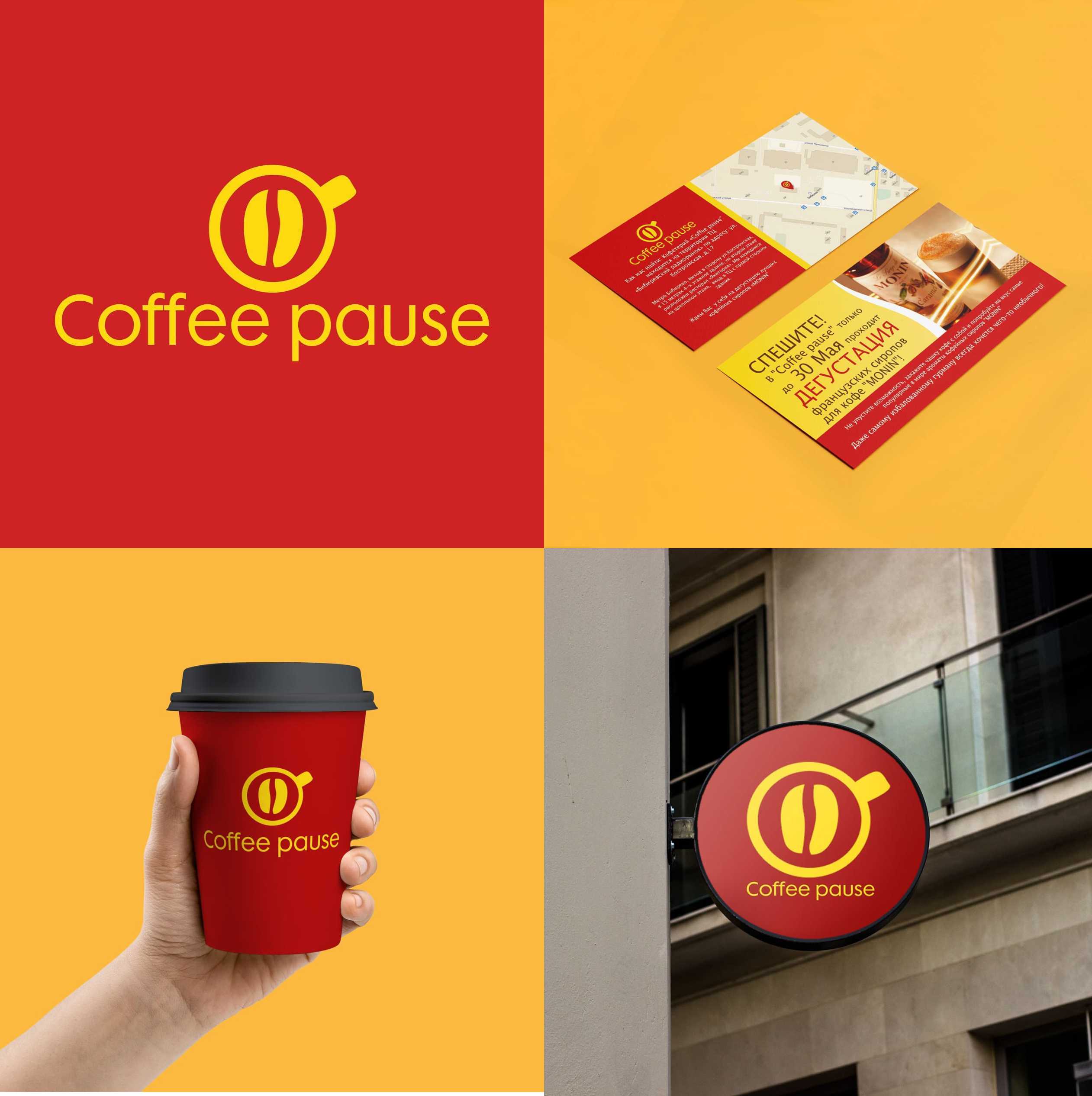
Development of a flyer for a new establishment. During the process, it turned out that the client does not have a logo — and I decided to create one voluntarily, based on the name and atmosphere.
Logo concept:
The symbol of a cup and a coffee bean was chosen intentionally — it reflects the philosophy of "Coffee Pause": a place where you can briefly stop, reboot, and enjoy the moment. Simple graphics — as a visual gesture of care.
The cup and coffee bean serve as a visual invitation: "Stop. Take a break. Feel the moment."
The flyer is designed with readability, visual balance, and an inviting atmosphere in mind — with an emphasis on key sentences, styled consistently with the logo.