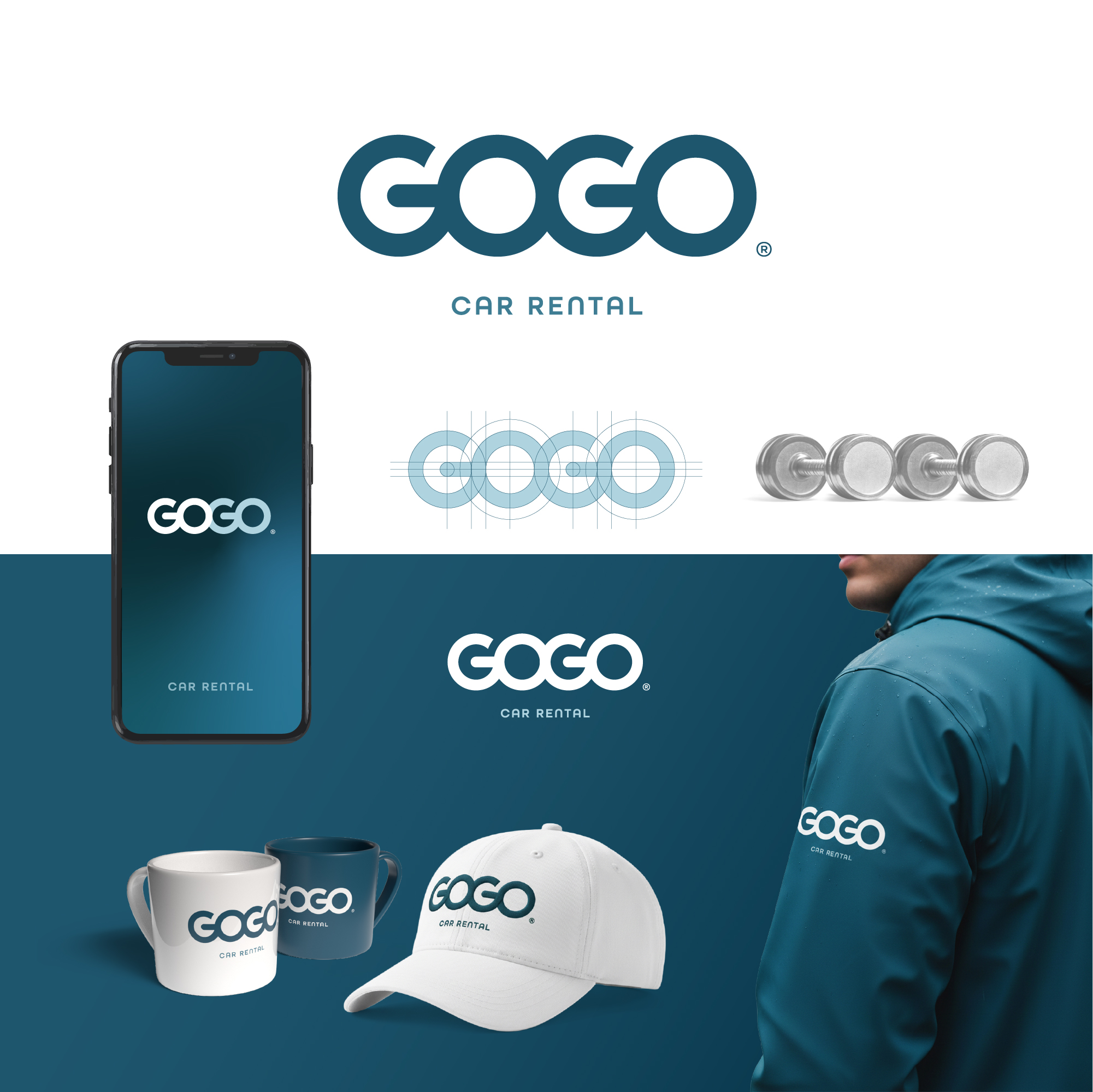
Wordmark GOGO
constructed as a structural system
of two axes and four wheels,
integrated directly
into the typography of the name.
The round shapes of the letters O function as wheels,
while the horizontal elements in G create
a sense of axial structure, establishing
an association with automotive suspension.
This solution allows for conveying
the automotive nature of the brand at a basic
"genetic" level, without resorting to direct
depictions of cars or parts.
The logo maintains simplicity, scalability
and confidently works as an independent mark.
The restrained color palette forms
a modern and reliable character of the identity,
clean geometry and balanced proportions
ensure clear recognizability of the logo
across digital and physical media —
from mobile interfaces to branded clothing.
#logotype
constructed as a structural system
of two axes and four wheels,
integrated directly
into the typography of the name.
The round shapes of the letters O function as wheels,
while the horizontal elements in G create
a sense of axial structure, establishing
an association with automotive suspension.
This solution allows for conveying
the automotive nature of the brand at a basic
"genetic" level, without resorting to direct
depictions of cars or parts.
The logo maintains simplicity, scalability
and confidently works as an independent mark.
The restrained color palette forms
a modern and reliable character of the identity,
clean geometry and balanced proportions
ensure clear recognizability of the logo
across digital and physical media —
from mobile interfaces to branded clothing.
#logotype